Rising Tide
Mission-led Webflow website for a South Florida car wash
Rising Tide Car Wash's new Webflow site puts its mission of employing professionals with autism next to Ripple Club memberships, locations, and franchising.
Next project:
Just Salad

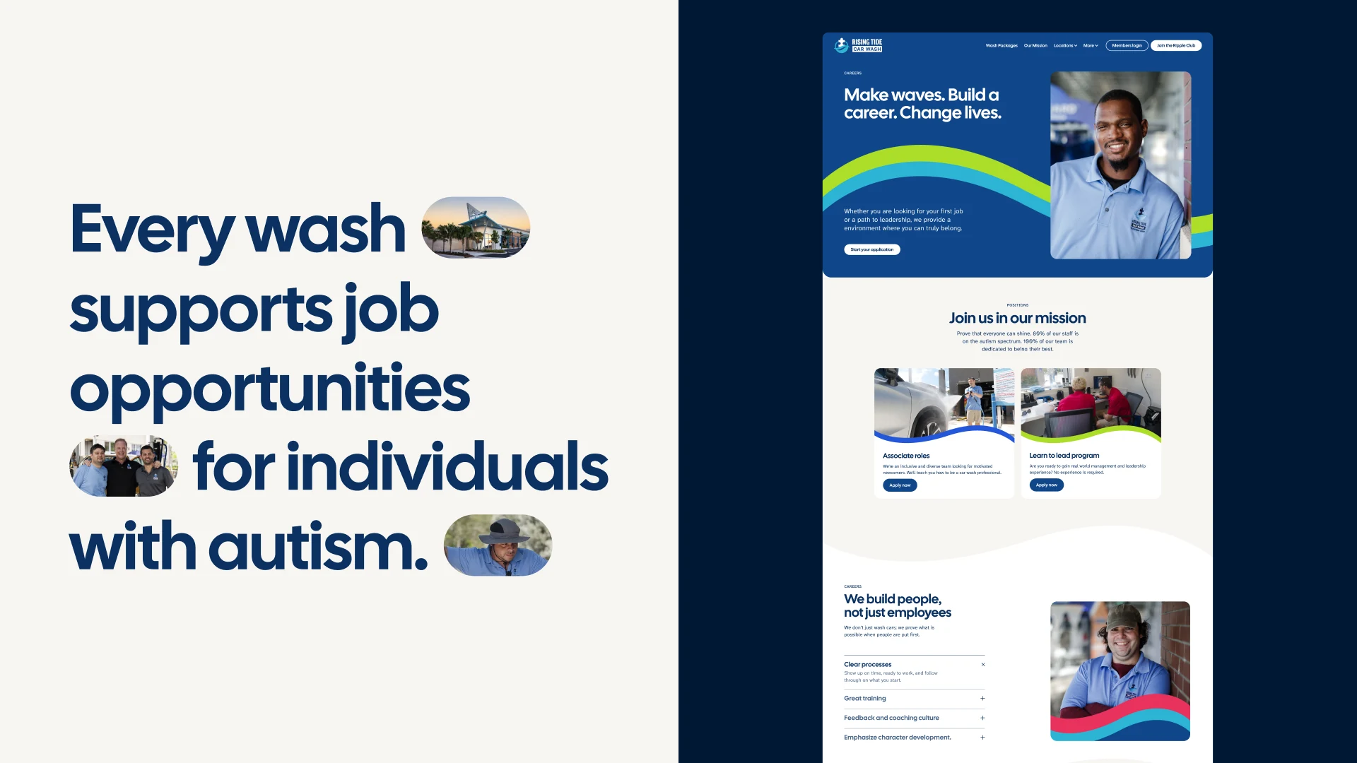
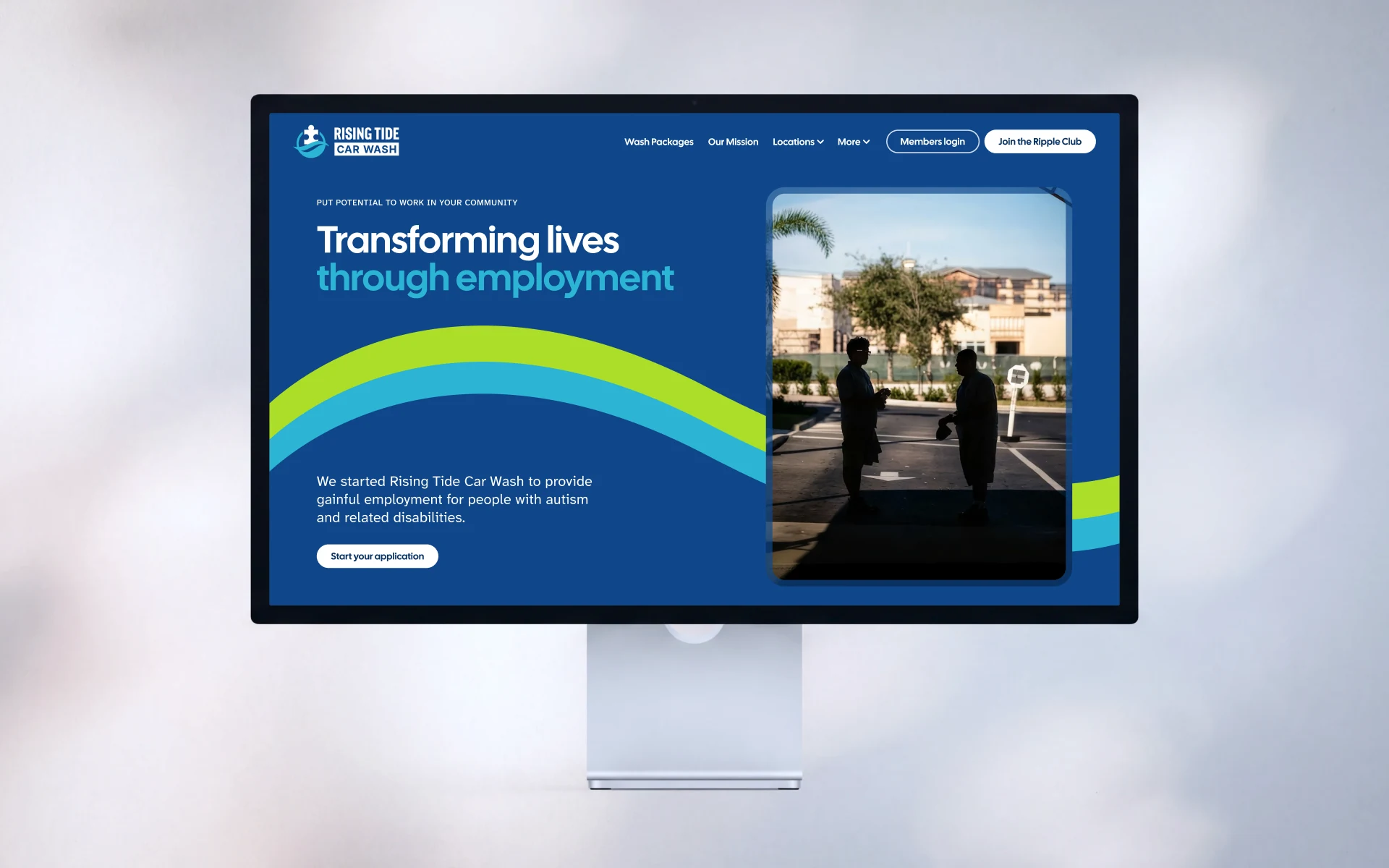
The wave in Rising Tide's logo became the site's main graphic device. It carries the brand colors from page to page and moves as you scroll, so even a page of hours and prices looks like Rising Tide.
A lot of Rising Tide's customers arrive on a phone, so every layout was designed for mobile with the same care as desktop. Each page puts what people came for near the top, with less scrolling to reach it.
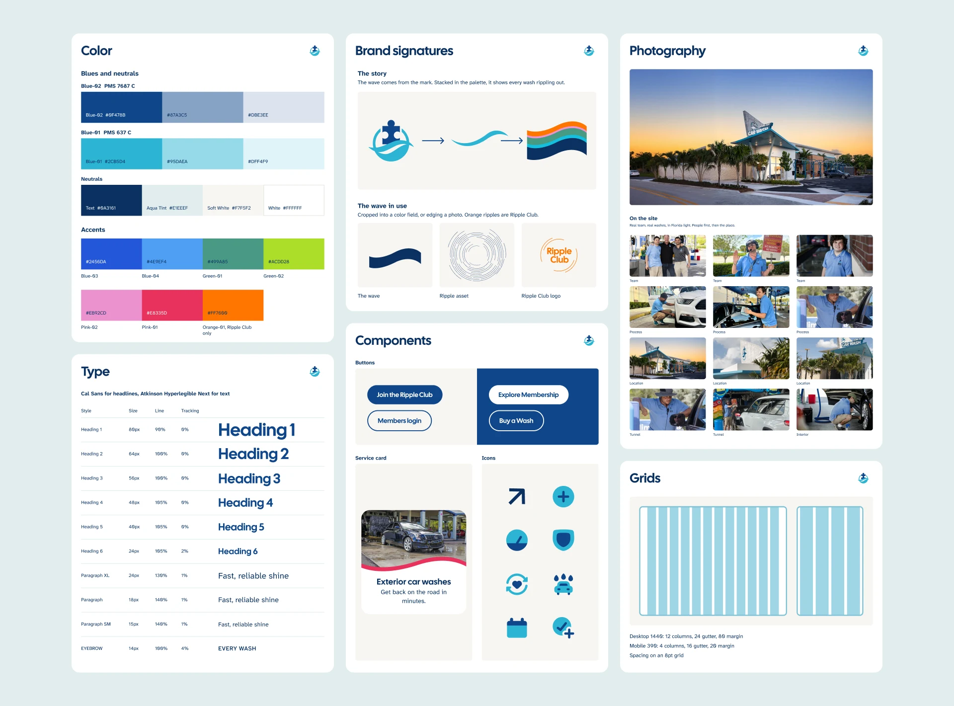
The photography is Rising Tide's own, and it shows the people the business was built for. We gave them room on nearly every page, because a company that exists to create careers should look like the people in them.
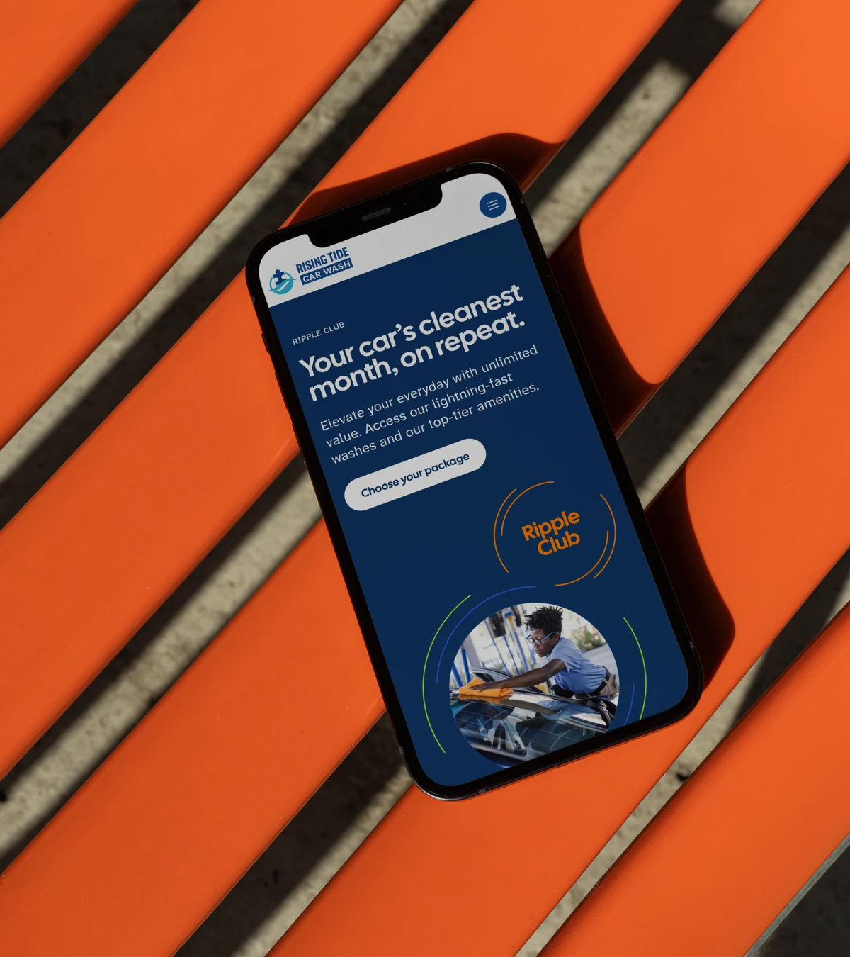
Tom wanted the Ripple Club to show that a membership reaches past the car wash and into the community. Orange rings that keep moving outward carry that idea, and orange is reserved for the program everywhere else on the site.
THE PUZZLE
Most of Rising Tide's revenue comes from local members who wash their cars every week. Co-founder and COO Tom D'Eri told us at kickoff that the website was where the company's messaging fell apart. Members had trouble managing their plans, often from a phone, and people who came to sign up got lost before they finished. The mission sat on a page of its own.
That mission is the reason the company exists. The D'Eri family bought a car wash in 2012 to create careers for people with autism. About 80% of the staff are now professionals with autism, and more than 250 careers have started there. Most car wash websites are a menu and a sign-up button. Rising Tide needed a good menu and a good button, plus a reason for drivers to feel something about their $30 a month.
THE SOLUTION
Designer Jess Pitera refined the brand and brought us in. She kept the original logo, a puzzle piece lifted by the tide, and refreshed the colors, type, and messaging. We built that early system out for the web, with a wider palette, a type system, a grid, icons, motion, and rules for photography. Every page was designed in Figma and built in Webflow from a component library.
One of Tom's goals shaped the rest: make the customer the hero of the mission. So the mission shows up on the pages people already use. The homepage carries the line Tom liked best, "Every wash funds meaningful employment for professionals with autism." Pricing works as a short path: choose exterior or interior, compare the packages, see what each includes, and pick one. The 50% off first month offer came up in all three rounds of Tom's feedback, and it got bigger every time.
THE IMPACT
The Rising Tide team runs the site themselves. New pages come together from the component library, and any combination still looks finished. Store hours are entered once and update everywhere. When a location closes for maintenance or a storm, staff turn on an alert instead of calling a developer. In South Florida, "weather permitting" gets a lot of use.
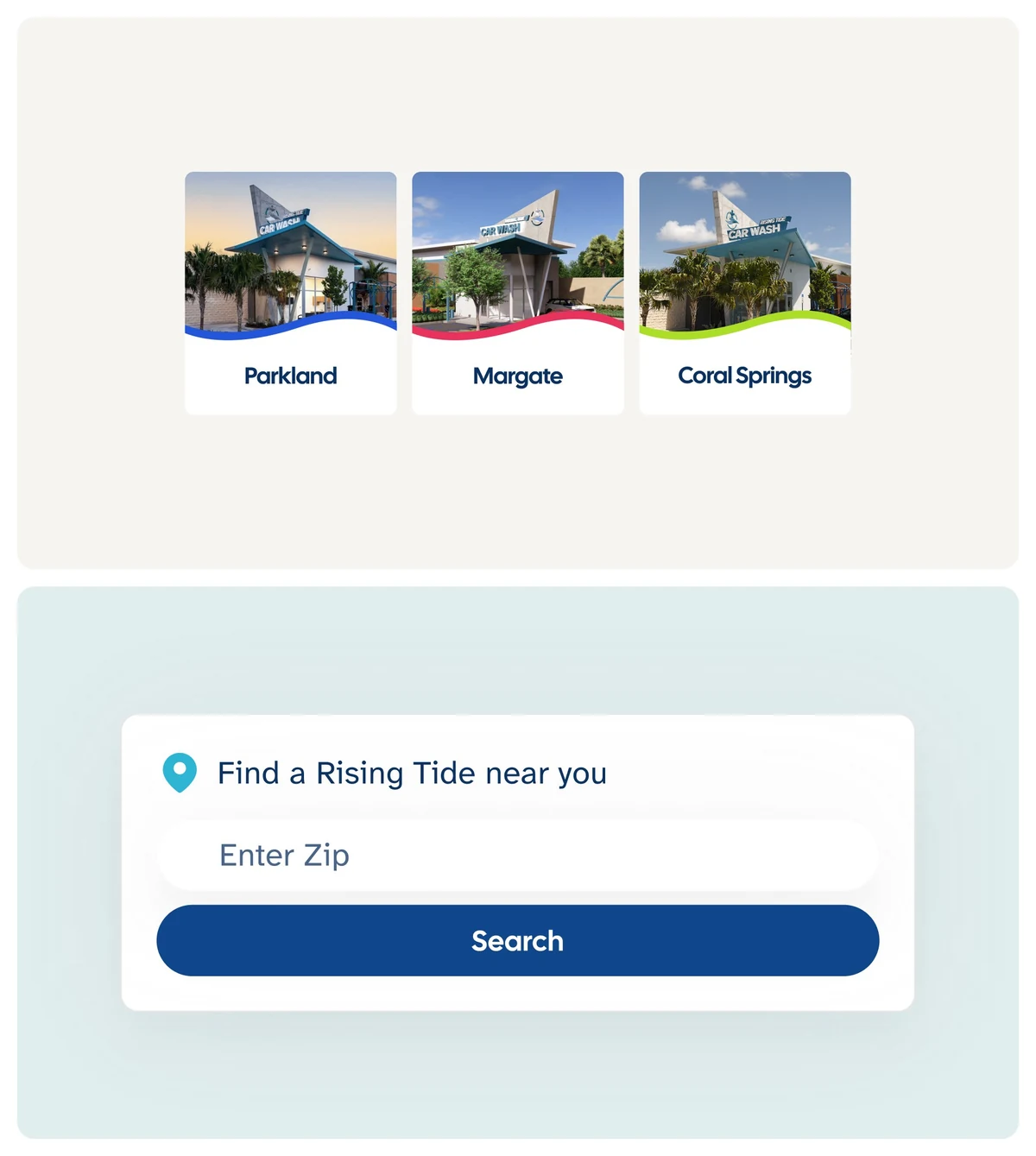
A ZIP code finder sends drivers to the nearest wash. There are three today, and the finder is built for the many more Rising Tide plans to open. Prospective franchisees have a page that makes the case with fees, territory, and requirements.
Rising Tide
Mission-led Webflow website for a South Florida car wash
- Zoey Russomano
- Leonardo Mattar
- Jason Debiak
- Mirko Santangelo
- Webflow
- GSAP
THE PUZZLE
Most of Rising Tide's revenue comes from local members who wash their cars every week. Co-founder and COO Tom D'Eri told us at kickoff that the website was where the company's messaging fell apart. Members had trouble managing their plans, often from a phone, and people who came to sign up got lost before they finished. The mission sat on a page of its own.
That mission is the reason the company exists. The D'Eri family bought a car wash in 2012 to create careers for people with autism. About 80% of the staff are now professionals with autism, and more than 250 careers have started there. Most car wash websites are a menu and a sign-up button. Rising Tide needed a good menu and a good button, plus a reason for drivers to feel something about their $30 a month.
THE SOLUTION
Designer Jess Pitera refined the brand and brought us in. She kept the original logo, a puzzle piece lifted by the tide, and refreshed the colors, type, and messaging. We built that early system out for the web, with a wider palette, a type system, a grid, icons, motion, and rules for photography. Every page was designed in Figma and built in Webflow from a component library.
One of Tom's goals shaped the rest: make the customer the hero of the mission. So the mission shows up on the pages people already use. The homepage carries the line Tom liked best, "Every wash funds meaningful employment for professionals with autism." Pricing works as a short path: choose exterior or interior, compare the packages, see what each includes, and pick one. The 50% off first month offer came up in all three rounds of Tom's feedback, and it got bigger every time.
THE IMPACT
The Rising Tide team runs the site themselves. New pages come together from the component library, and any combination still looks finished. Store hours are entered once and update everywhere. When a location closes for maintenance or a storm, staff turn on an alert instead of calling a developer. In South Florida, "weather permitting" gets a lot of use.
A ZIP code finder sends drivers to the nearest wash. There are three today, and the finder is built for the many more Rising Tide plans to open. Prospective franchisees have a page that makes the case with fees, territory, and requirements.