
Brand system and Webflow redesign for venture capital firm
M13's investment thesis had evolved faster than its brand could keep up. Paper Tiger built an expanded design system and a Webflow site that speaks to founders first and LPs second, without making either audience feel like an afterthought.


THE PUZZLE
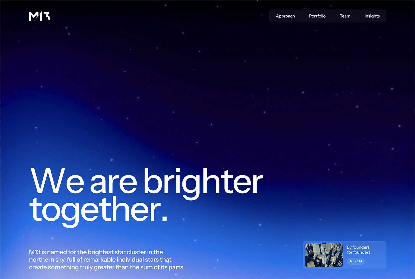
M13 is named for the brightest star cluster in the northern sky, which is a good metaphor for a venture firm and a difficult one to design around without drifting into stock-photo nebulas. The bigger problem was that the firm had spent several years sharpening its thesis, narrowing to founders building through structural shifts, and none of that showed up in the brand or the website. The digital presence described a version of M13 that no longer existed.
The audiences made it harder. Institutional LPs want evidence, structure, and data they can move through carefully. Founders want to know within about forty seconds whether these people have actually built anything. Those are different documents, different reading speeds, and different definitions of proof. The old site tried to serve both by serving neither particularly well.
THE SOLUTION
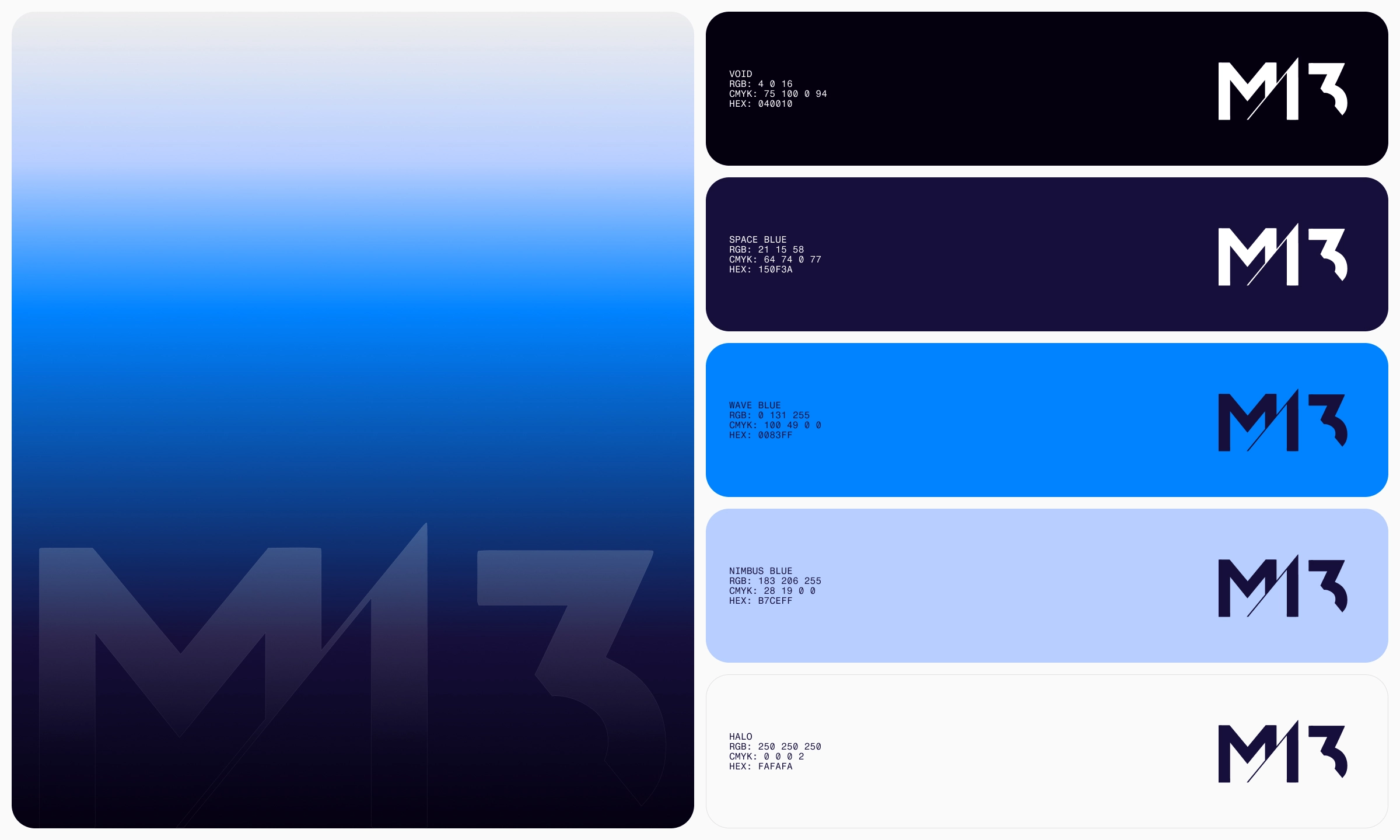
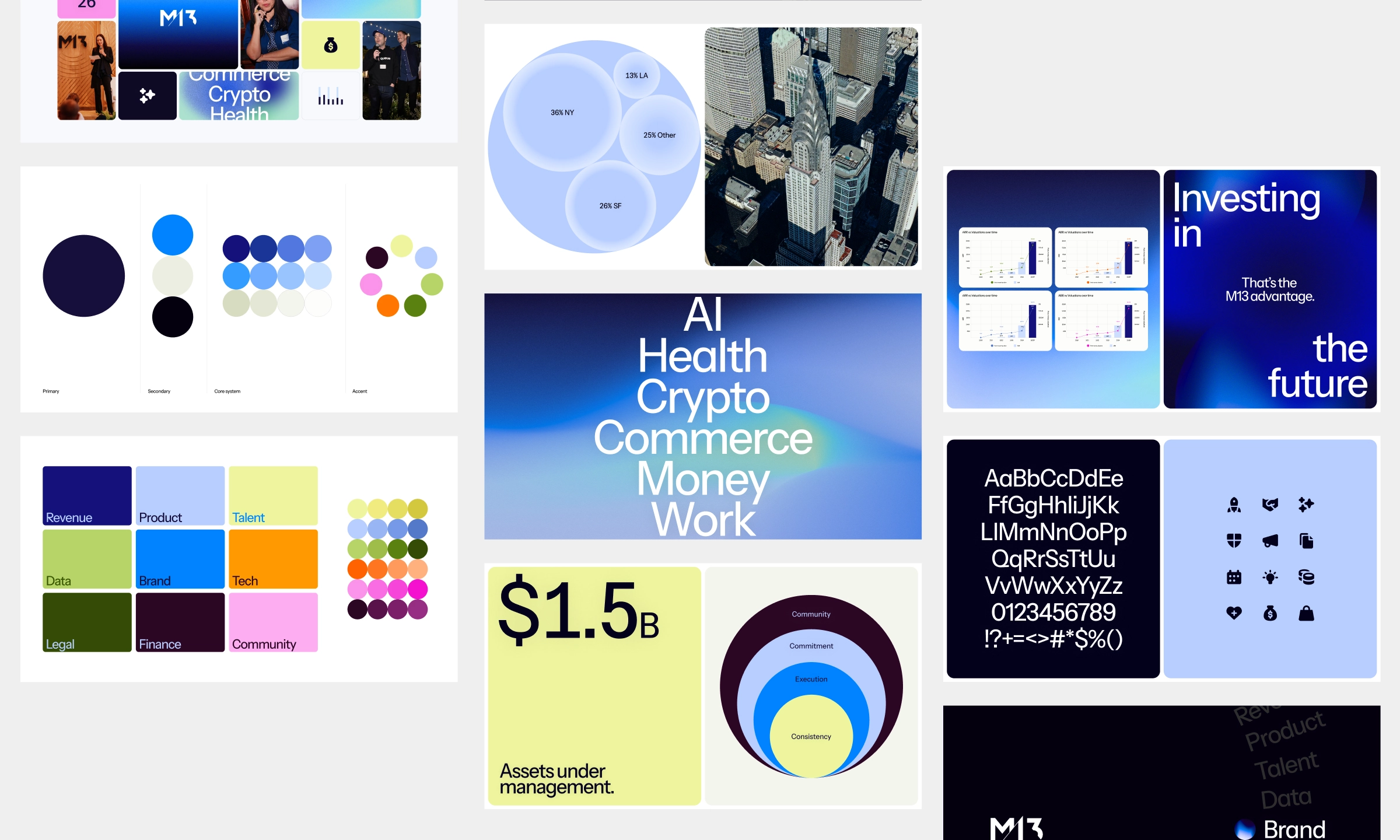
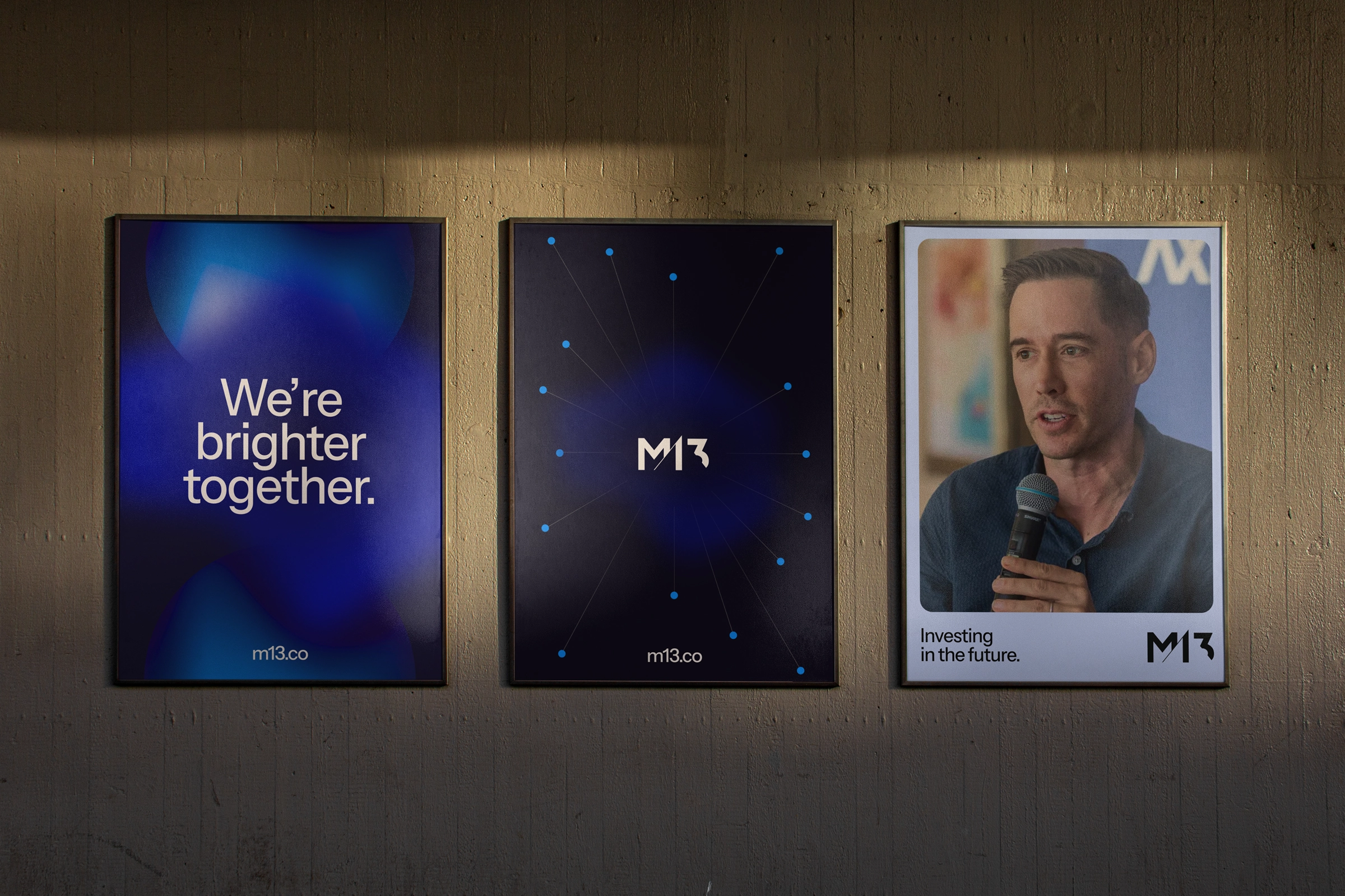
We started with the brand and let it drive the site rather than the other way around. The existing logo, navy palette, and celestial theme stayed. Everything around them got rebuilt for digital: a refined type system, defined color roles, iconography, and data visualization standards, plus the working templates the team actually uses day to day. Slide layouts for data-dense LP decks and narrative founder decks, letterhead and one-pagers, branded chart templates, social and email assets. The result reads ethereal and bold at the same time, which sounds like a contradiction until you see restraint doing the heavy lifting.
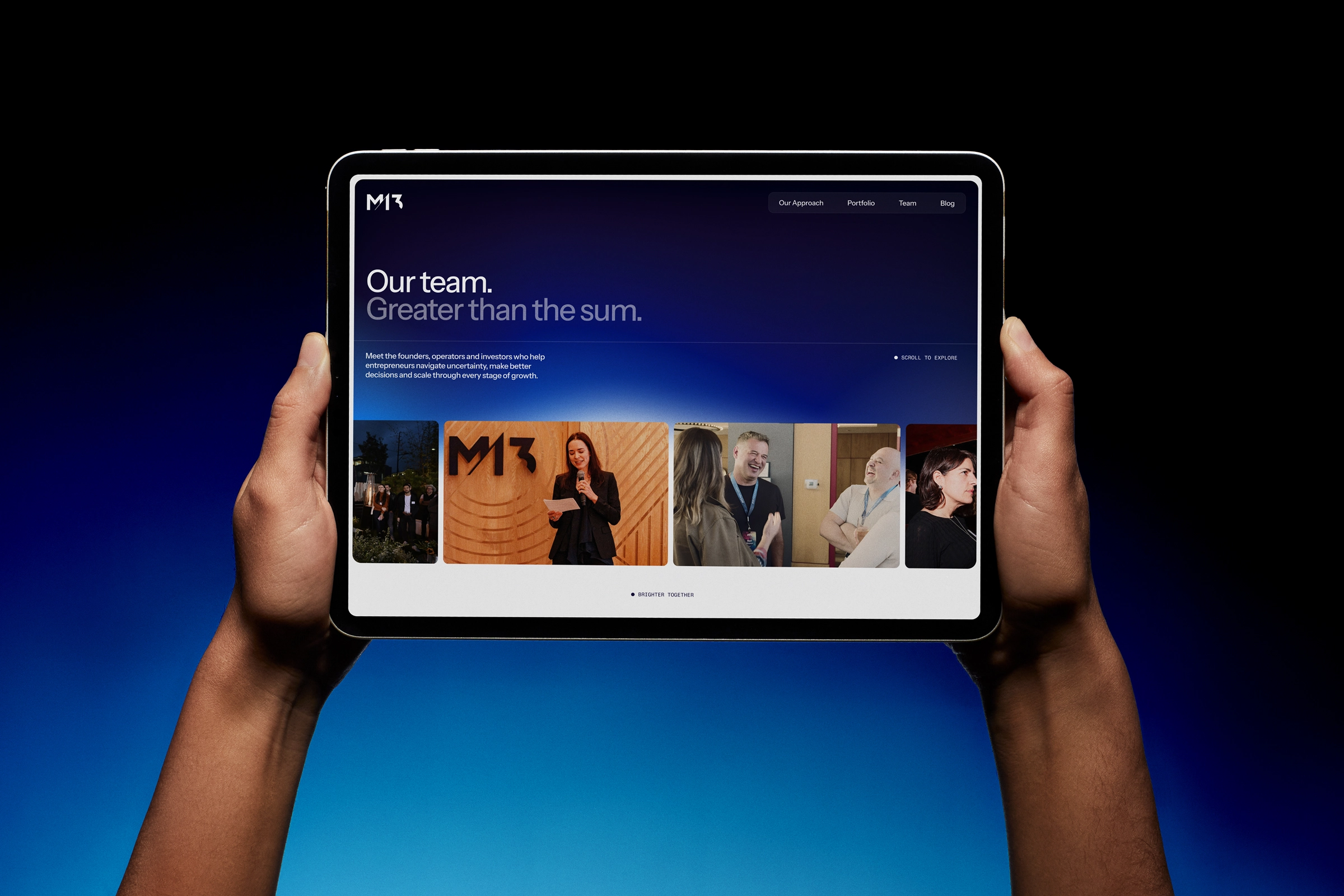
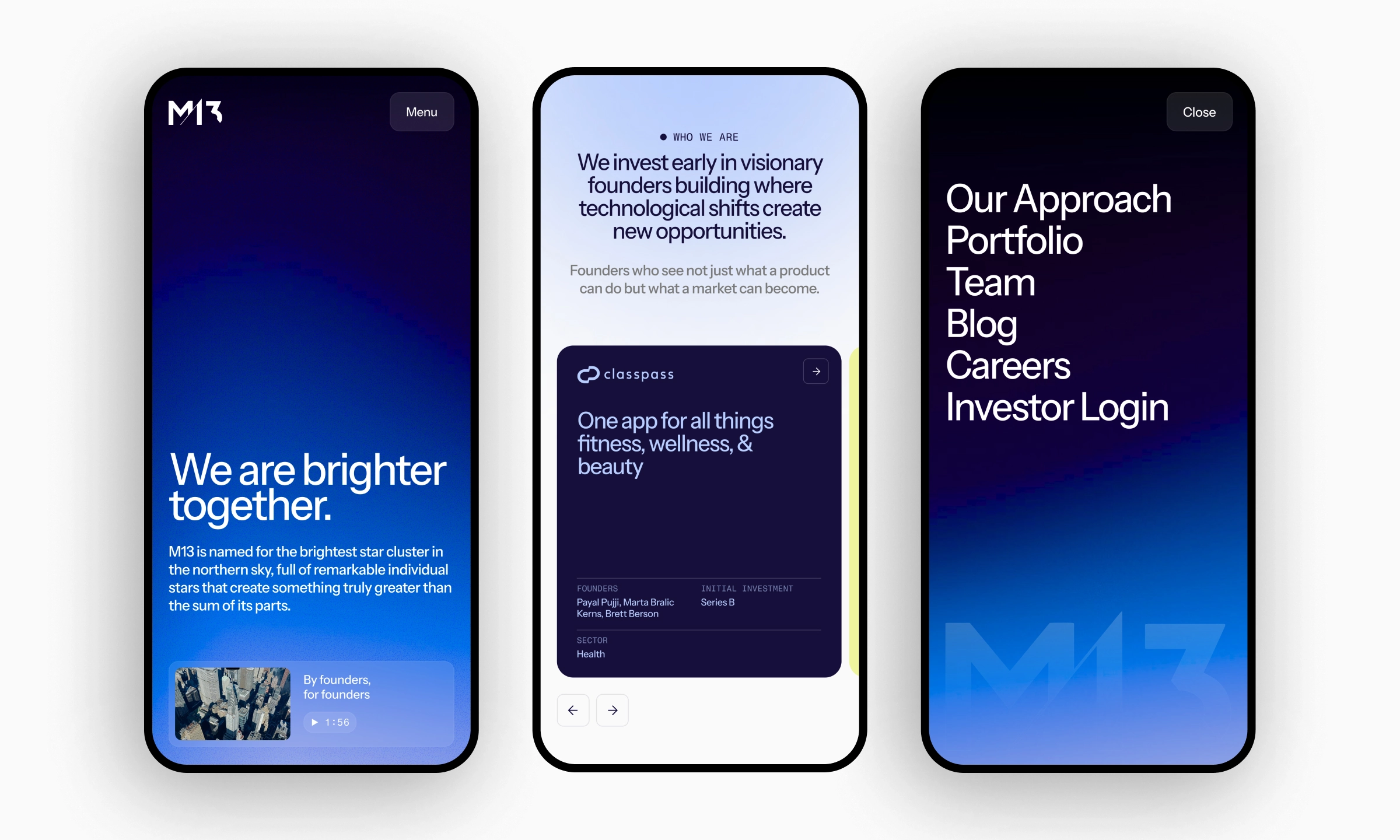
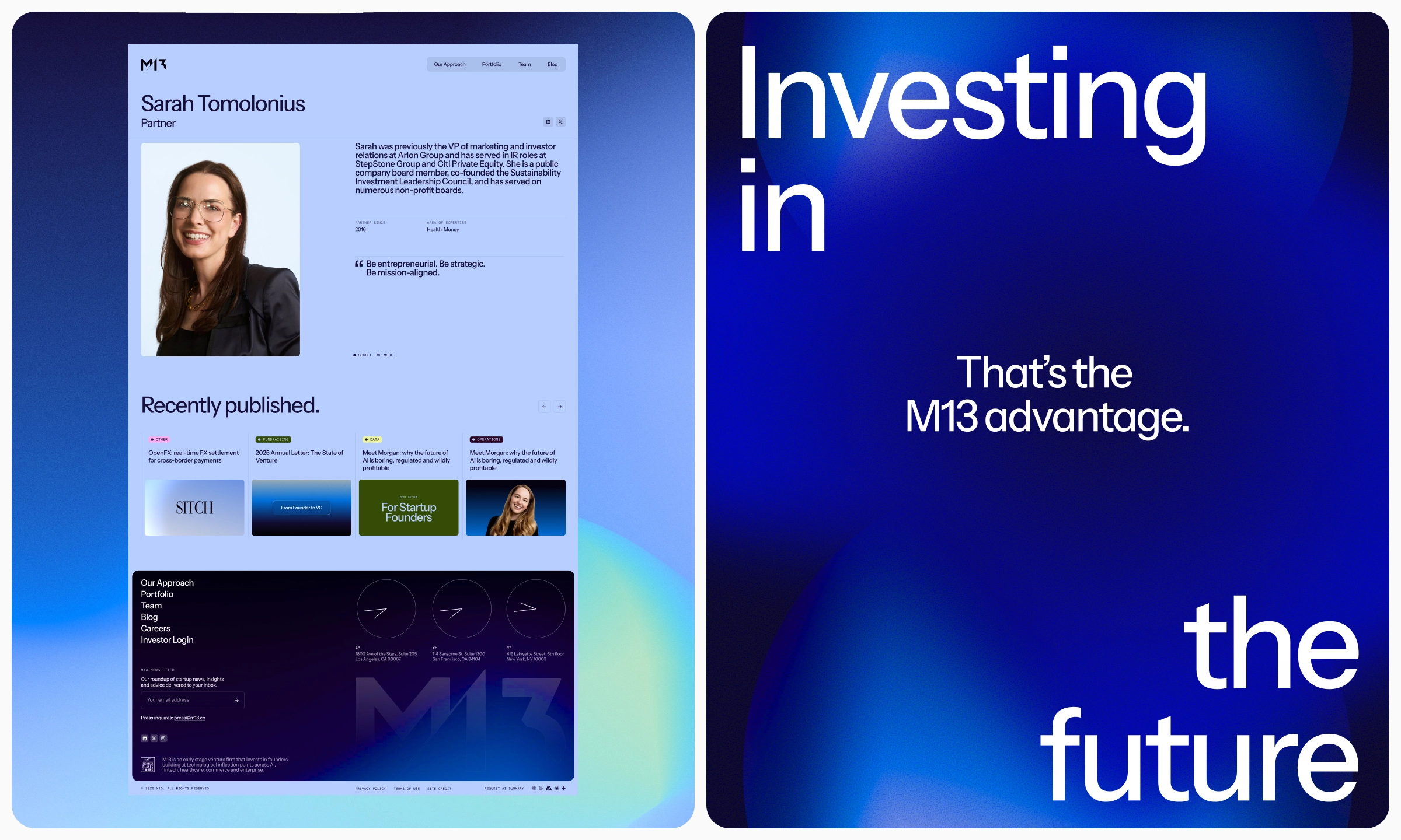
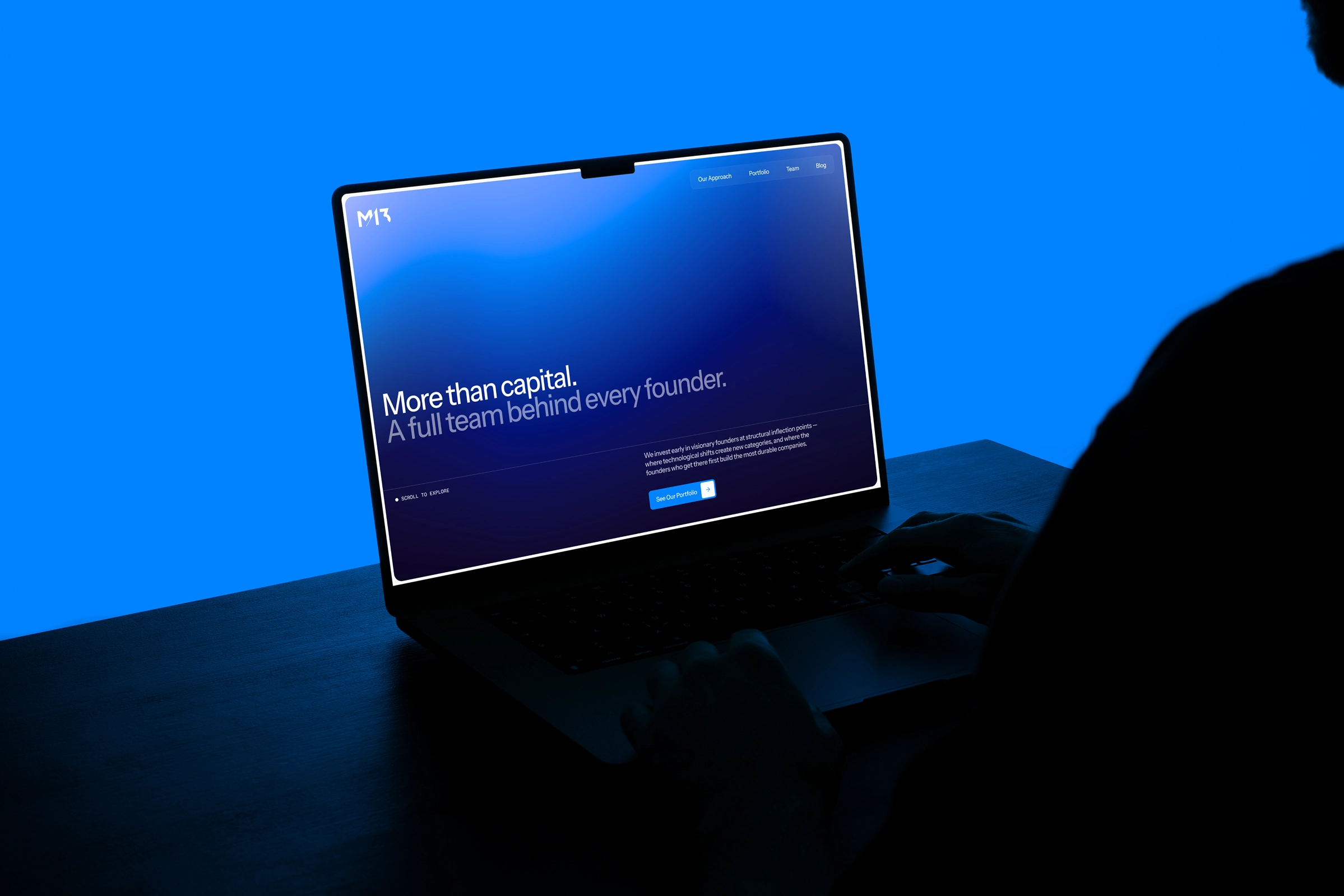
The site was built in Webflow as a structured storytelling environment rather than a brochure. Founders are the primary path, LPs the secondary one, and the architecture accommodates someone skimming for two minutes or evaluating for two weeks. Content from the old site was migrated selectively, only what still represented the current thesis. Underneath it: schema markup, semantic HTML, and GA4 and GTM instrumentation, built for traditional search and for the AI tools founders now use to vet investors before anyone picks up a phone.
THE IMPACT
M13 now has a brand that matches the firm and a system its team can run without a designer in the room. Decks, one-pagers, charts, and social assets come out looking like they belong to the same company, which is a low bar that a surprising number of firms fail to clear.
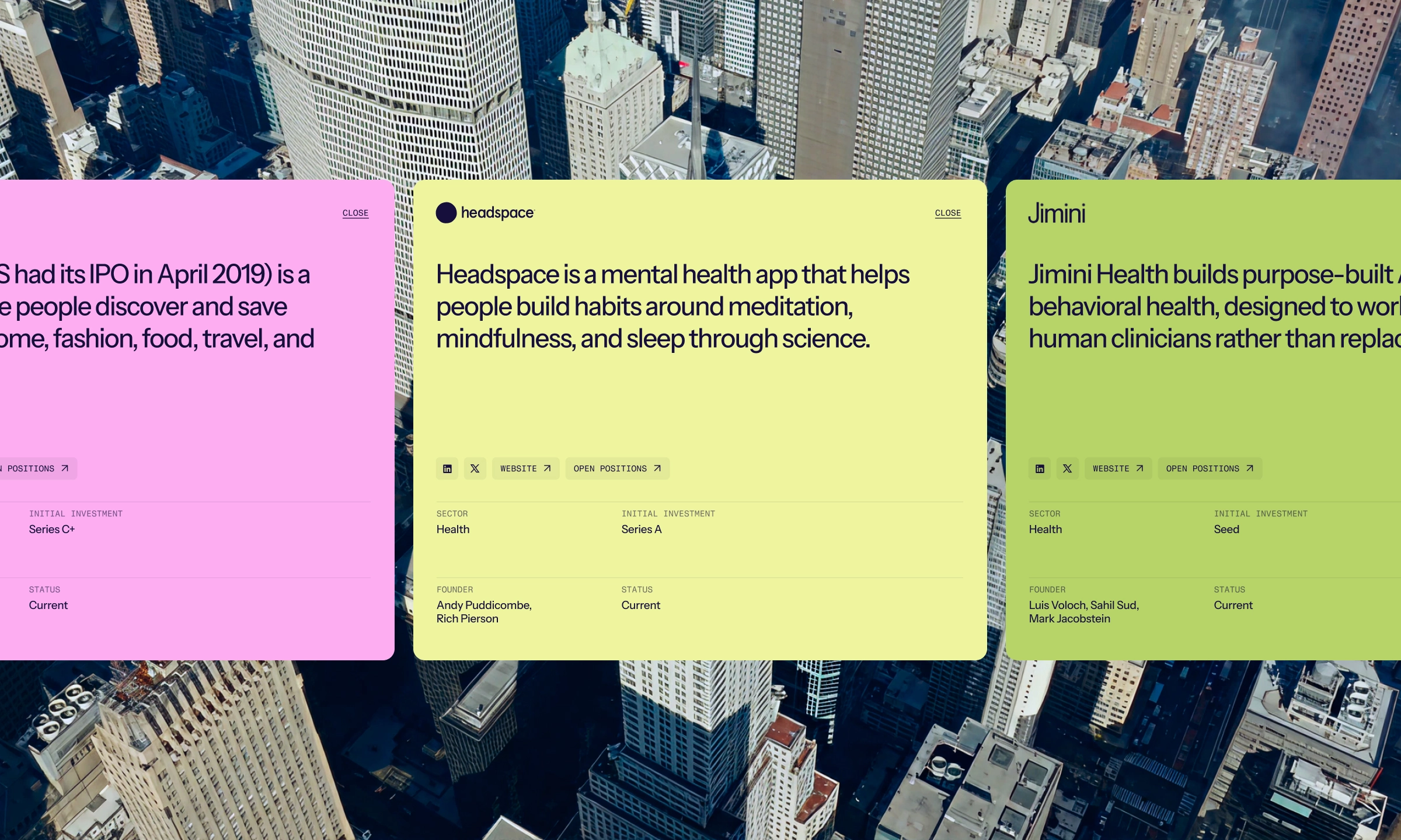
The site does the harder work of speaking to two audiences on one structure. Founders get the story, the operator credibility, and the portfolio proof up front. LPs get the depth when they go looking for it. And because the whole thing was built as a component system, M13 can keep publishing and evolving as the thesis does, which for a firm that just spent several years refining its position is the entire point.
M13
Brand system and Webflow redesign for venture capital firm
- Ashley Adams
- Mirko Santangelo
- Jason Debiak
- Jei Dawnn
- GSAP
- Figma
- Webflow
THE PUZZLE
M13 is named for the brightest star cluster in the northern sky, which is a good metaphor for a venture firm and a difficult one to design around without drifting into stock-photo nebulas. The bigger problem was that the firm had spent several years sharpening its thesis, narrowing to founders building through structural shifts, and none of that showed up in the brand or the website. The digital presence described a version of M13 that no longer existed.
The audiences made it harder. Institutional LPs want evidence, structure, and data they can move through carefully. Founders want to know within about forty seconds whether these people have actually built anything. Those are different documents, different reading speeds, and different definitions of proof. The old site tried to serve both by serving neither particularly well.
THE SOLUTION
We started with the brand and let it drive the site rather than the other way around. The existing logo, navy palette, and celestial theme stayed. Everything around them got rebuilt for digital: a refined type system, defined color roles, iconography, and data visualization standards, plus the working templates the team actually uses day to day. Slide layouts for data-dense LP decks and narrative founder decks, letterhead and one-pagers, branded chart templates, social and email assets. The result reads ethereal and bold at the same time, which sounds like a contradiction until you see restraint doing the heavy lifting.
The site was built in Webflow as a structured storytelling environment rather than a brochure. Founders are the primary path, LPs the secondary one, and the architecture accommodates someone skimming for two minutes or evaluating for two weeks. Content from the old site was migrated selectively, only what still represented the current thesis. Underneath it: schema markup, semantic HTML, and GA4 and GTM instrumentation, built for traditional search and for the AI tools founders now use to vet investors before anyone picks up a phone.
THE IMPACT
M13 now has a brand that matches the firm and a system its team can run without a designer in the room. Decks, one-pagers, charts, and social assets come out looking like they belong to the same company, which is a low bar that a surprising number of firms fail to clear.
The site does the harder work of speaking to two audiences on one structure. Founders get the story, the operator credibility, and the portfolio proof up front. LPs get the depth when they go looking for it. And because the whole thing was built as a component system, M13 can keep publishing and evolving as the thesis does, which for a firm that just spent several years refining its position is the entire point.
RELATED clients
.avif)

it starts with a conversation
Don’t hesitate to contact us. We aim to provide value to everyone who does.