Hudson County, NJ
Countywide brand identity system for New Jersey government
Case study: a countywide brand identity for Hudson County, New Jersey, built with Moxie Strategies. One accessible system that unifies twelve municipalities.

Next project:
Betterment

.webp)
THE PUZZLE
Hudson County is one of the densest, most diverse places in the country. Food, language, music, and neighborhood identity change block by block, and the county government does critical work across all of it. The identity, though, said almost none of that. It had scattered across departments, with primary colors applied at random and a seal that struggled to reproduce at the sizes it got used most. Residents identify with their town first, so the county was largely invisible in the places it mattered.
County Executive Craig Guy wanted the branding to finally match the culture. The brief made the real test clear: does this feel understandable and respectful to someone who does not already trust the government? The system had to work for immigrant and multilingual communities, for residents with the greatest service needs, and for younger residents who expect a government to be at least as legible as an app. One county, twelve municipalities, dozens of departments, one language that could carry all of it.
THE SOLUTION
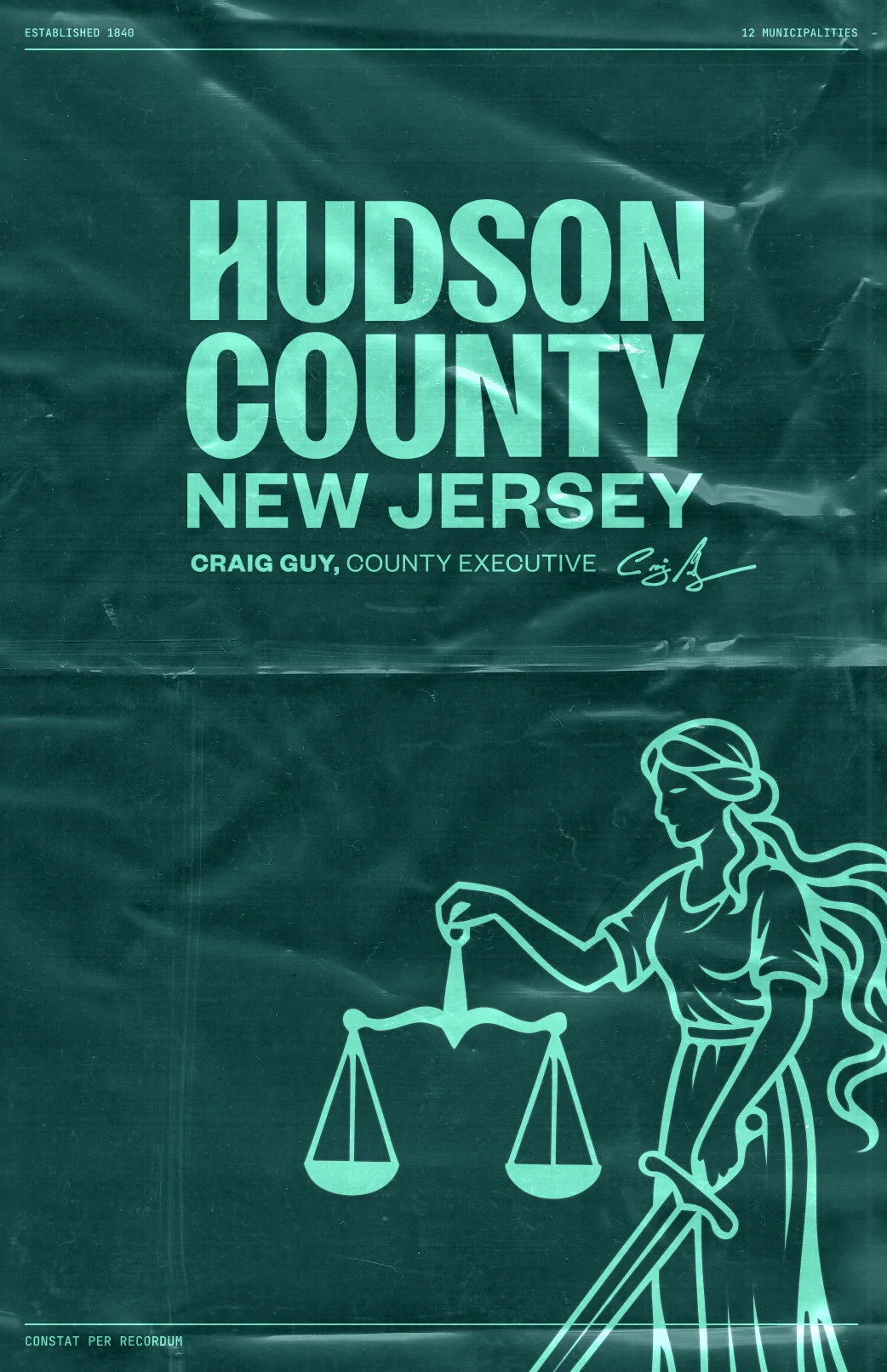
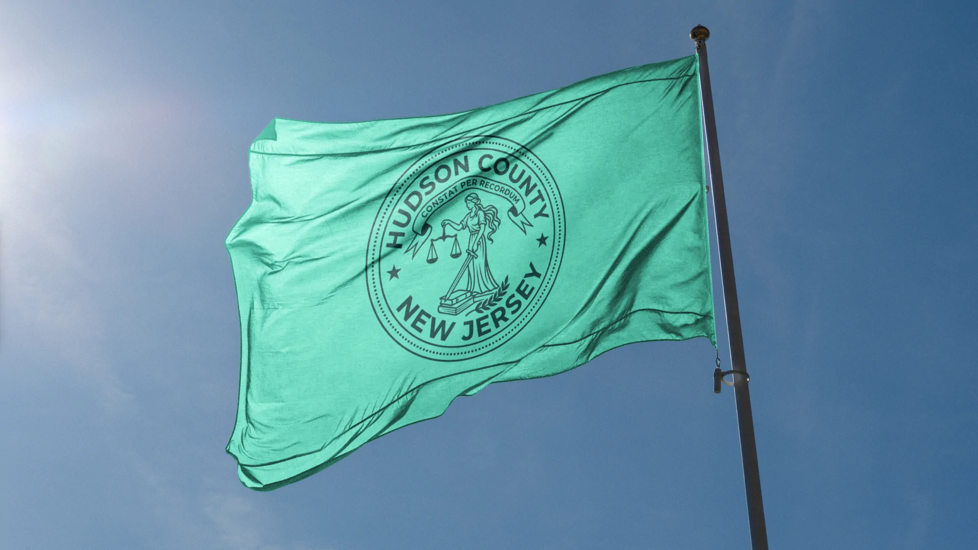
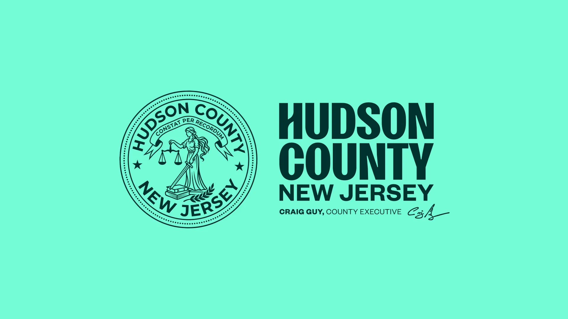
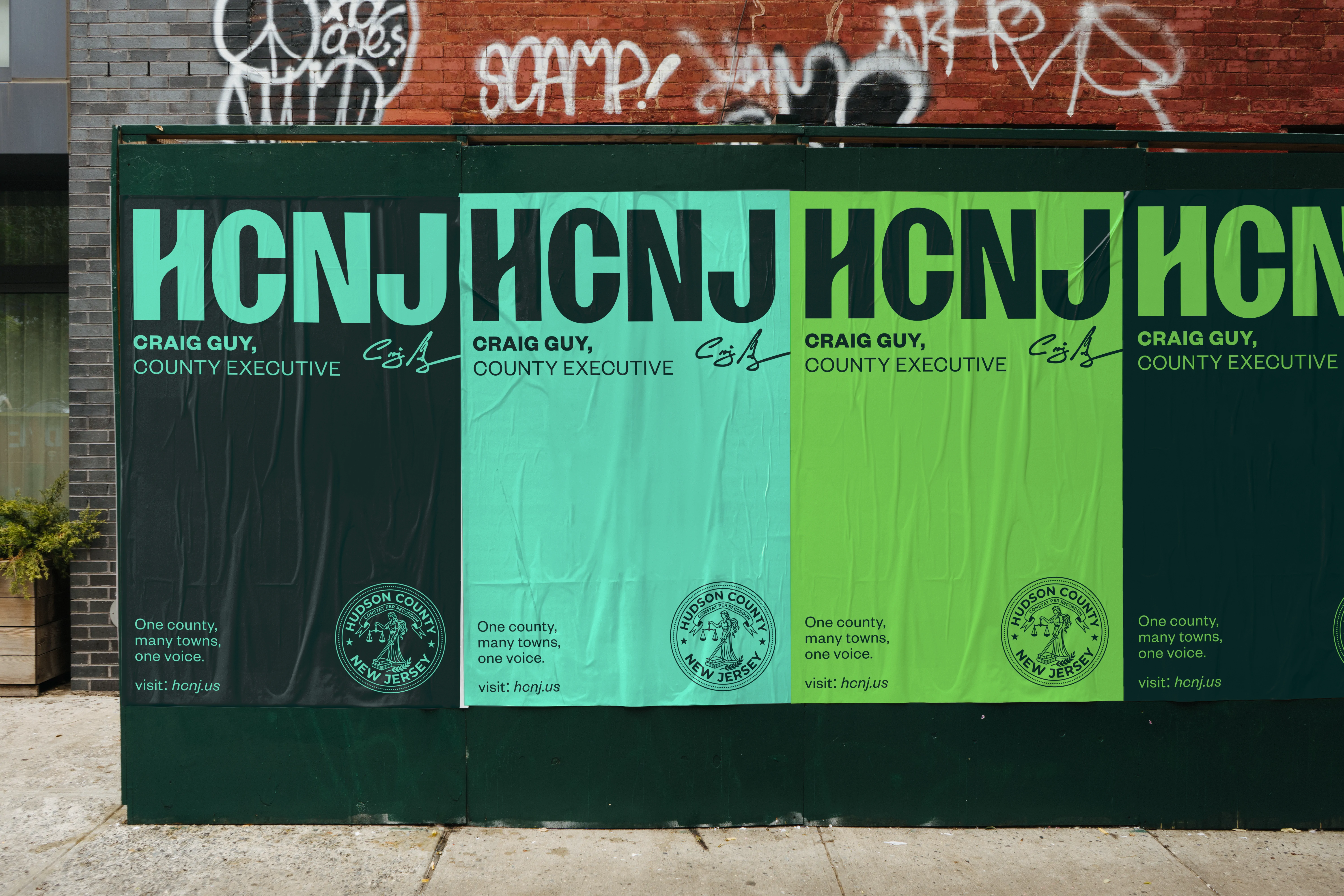
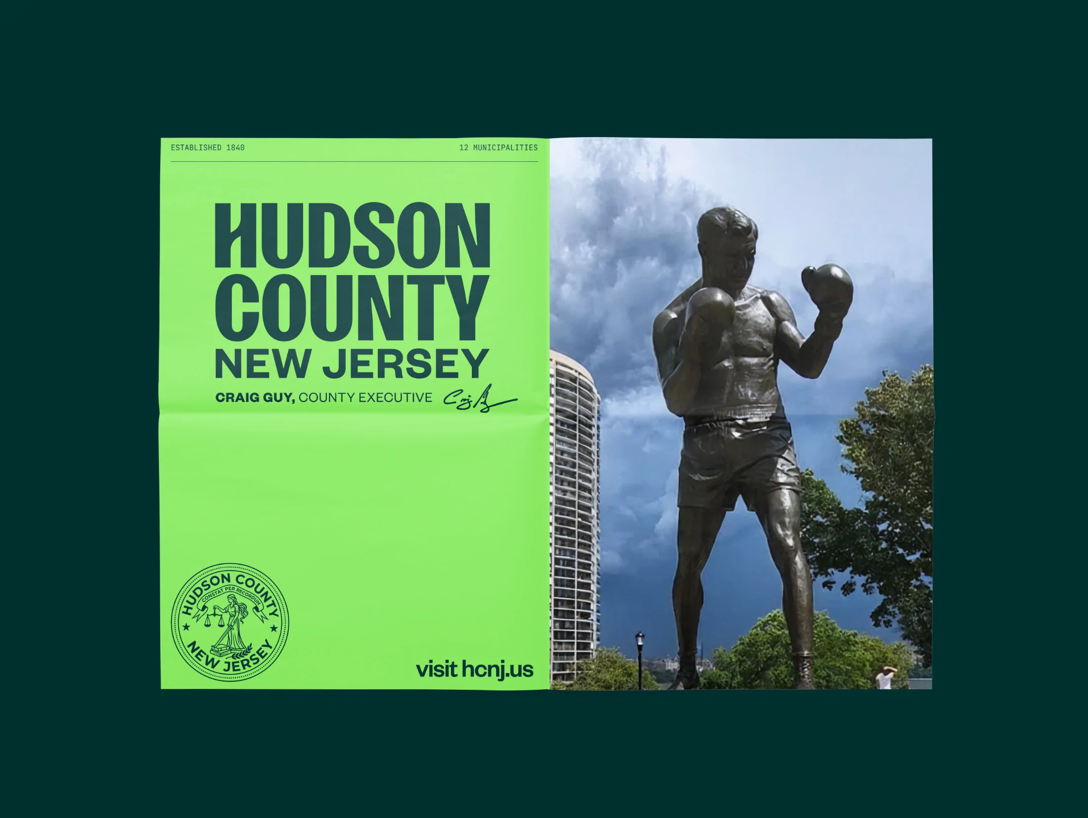
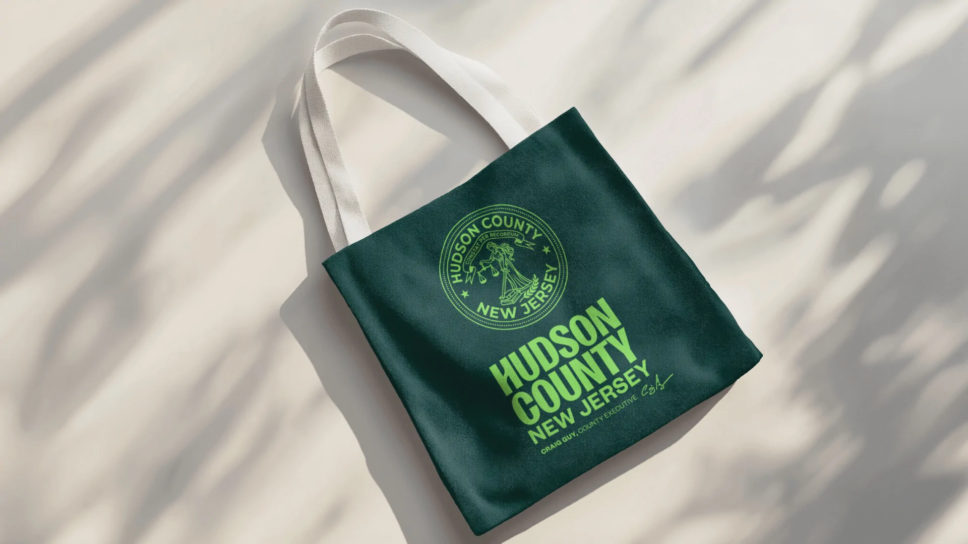
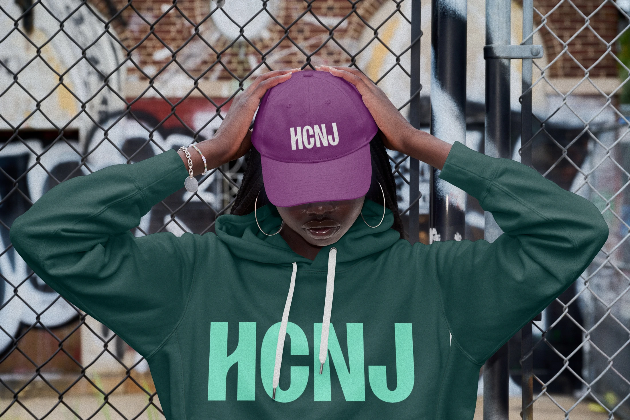
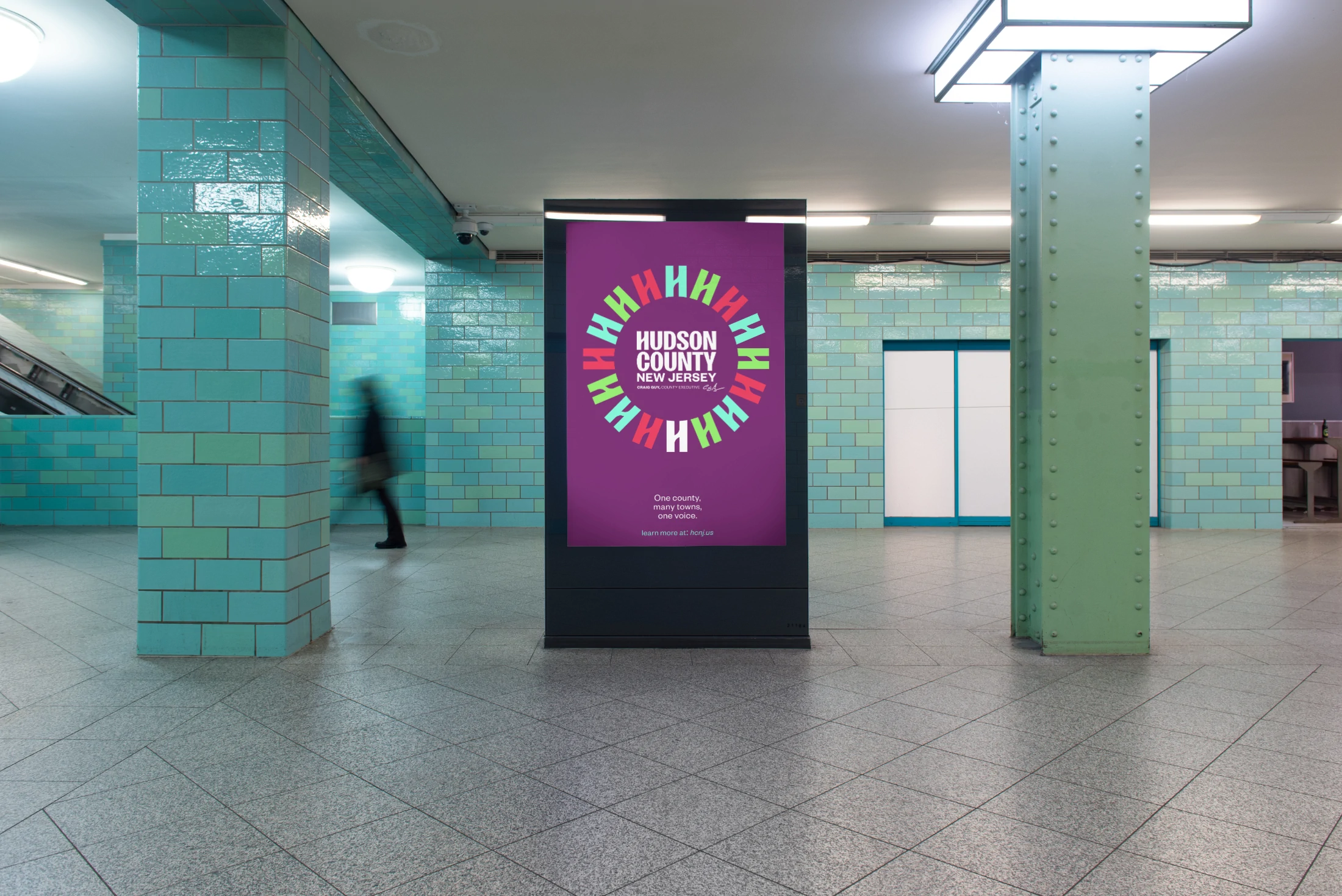
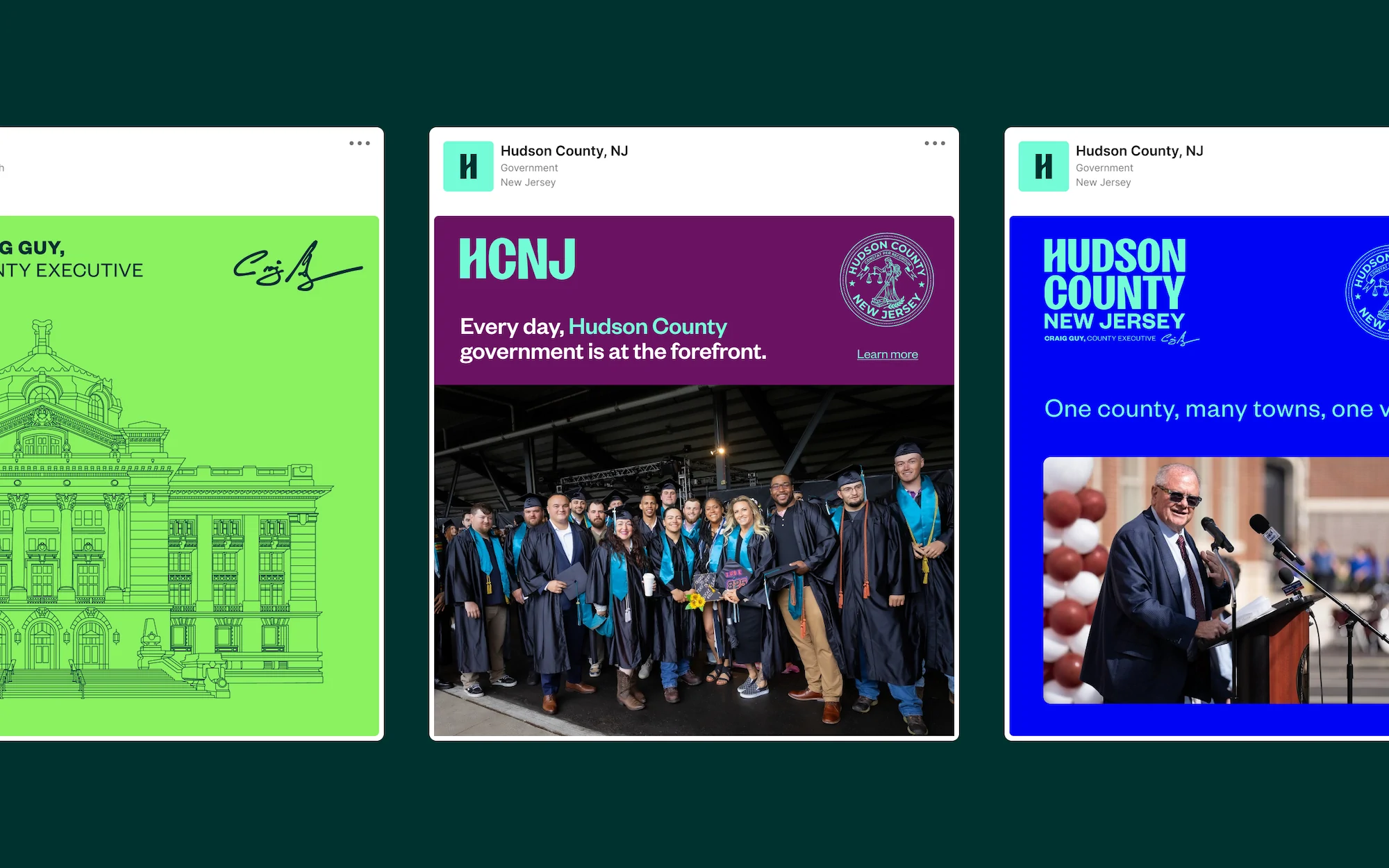
We worked in partnership with Moxie Strategies, who led research, strategy, and messaging while we handled visual identity. The result is bold, brash, and built to be approached. A redrawn seal that reproduces cleanly from a lapel pin to a highway sign. A new HCNJ identity that carries everyday service communications with confidence. A typography system built for legibility at every size and an expansive, vibrant color palette that lets departments and towns sound like themselves without fragmenting the county.
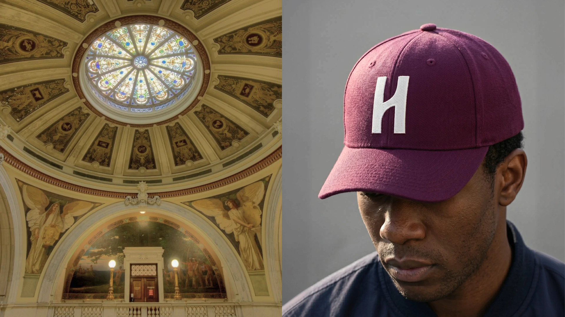
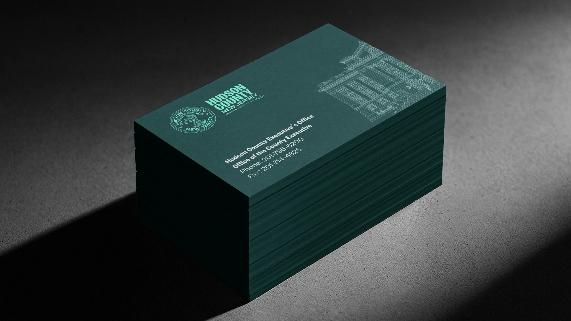
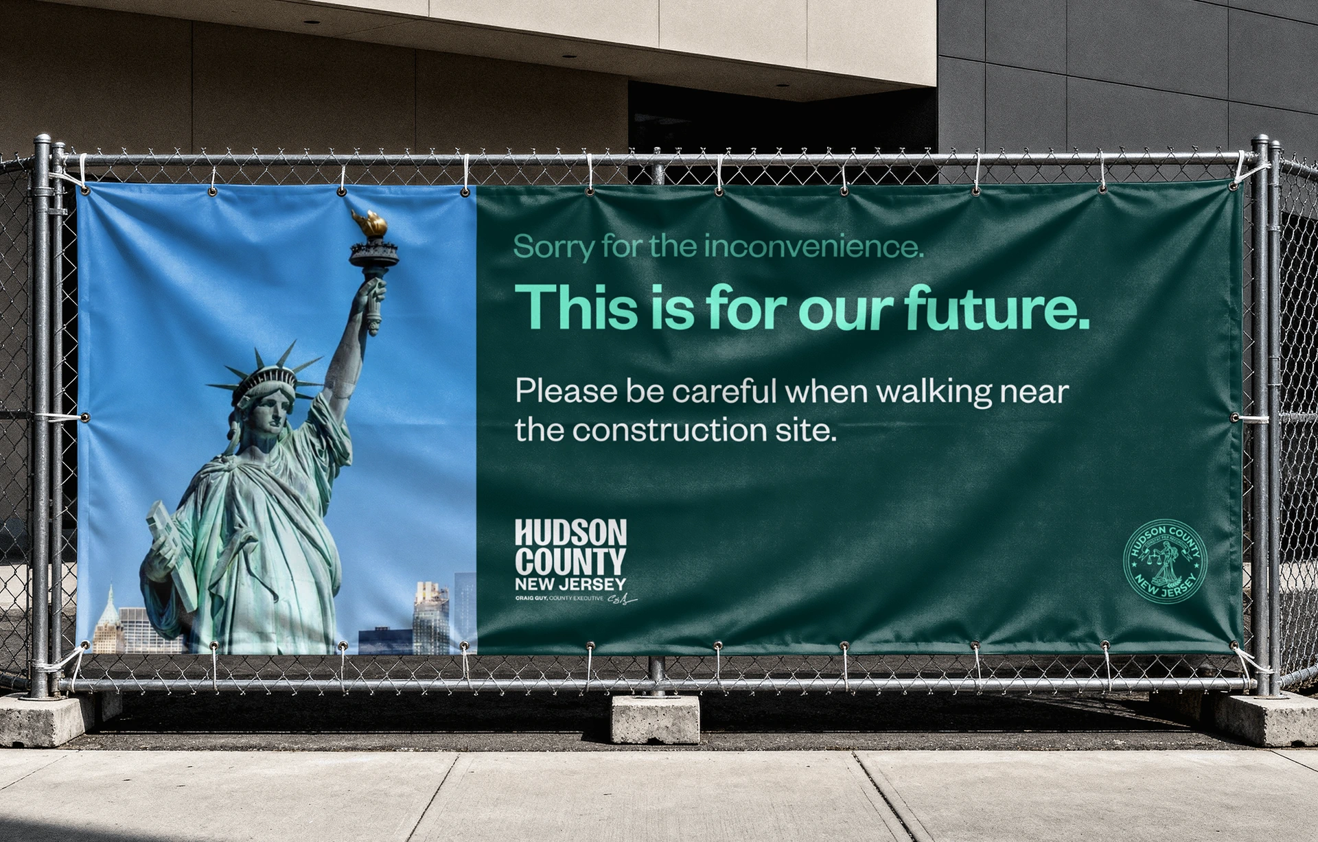
The applied work is where a civic system lives or dies, so we built it out: signage, business cards, swag, an original illustration of the courthouse, and light video work showing the actual range of the county's landscape. Everything was checked against ADA contrast standards and structured to be multilingual-ready. The whole system is documented in a brand guidelines microsite rather than a PDF that gets emailed once and lost, which matters when the people applying it work across dozens of departments and did not attend the presentation.
THE IMPACT
Hudson County now has an identity with real swagger, and a system underneath it that behaves like infrastructure. Departments can produce their own materials without commissioning design work or improvising, and the results still read as one government. The guidelines microsite means adoption does not depend on anyone remembering where the files live.
The bold direction does real work beyond looking current. It makes the county visible in places it was previously invisible, and it signals a government that expects to be approached rather than one hoping to be left alone. If it succeeds, nobody will talk about the logo. They will just find what they need faster, and feel like someone thought about them.
Hudson County, NJ
Countywide brand identity system for New Jersey government
- Jason Debiak
- Zoey Russomano
- Mirko Santangelo
- Marc Debiak
THE PUZZLE
Hudson County is one of the densest, most diverse places in the country. Food, language, music, and neighborhood identity change block by block, and the county government does critical work across all of it. The identity, though, said almost none of that. It had scattered across departments, with primary colors applied at random and a seal that struggled to reproduce at the sizes it got used most. Residents identify with their town first, so the county was largely invisible in the places it mattered.
County Executive Craig Guy wanted the branding to finally match the culture. The brief made the real test clear: does this feel understandable and respectful to someone who does not already trust the government? The system had to work for immigrant and multilingual communities, for residents with the greatest service needs, and for younger residents who expect a government to be at least as legible as an app. One county, twelve municipalities, dozens of departments, one language that could carry all of it.
THE SOLUTION
We worked in partnership with Moxie Strategies, who led research, strategy, and messaging while we handled visual identity. The result is bold, brash, and built to be approached. A redrawn seal that reproduces cleanly from a lapel pin to a highway sign. A new HCNJ identity that carries everyday service communications with confidence. A typography system built for legibility at every size and an expansive, vibrant color palette that lets departments and towns sound like themselves without fragmenting the county.
The applied work is where a civic system lives or dies, so we built it out: signage, business cards, swag, an original illustration of the courthouse, and light video work showing the actual range of the county's landscape. Everything was checked against ADA contrast standards and structured to be multilingual-ready. The whole system is documented in a brand guidelines microsite rather than a PDF that gets emailed once and lost, which matters when the people applying it work across dozens of departments and did not attend the presentation.
THE IMPACT
Hudson County now has an identity with real swagger, and a system underneath it that behaves like infrastructure. Departments can produce their own materials without commissioning design work or improvising, and the results still read as one government. The guidelines microsite means adoption does not depend on anyone remembering where the files live.
The bold direction does real work beyond looking current. It makes the county visible in places it was previously invisible, and it signals a government that expects to be approached rather than one hoping to be left alone. If it succeeds, nobody will talk about the logo. They will just find what they need faster, and feel like someone thought about them.