A public rebrand gets judged by people who never asked for it
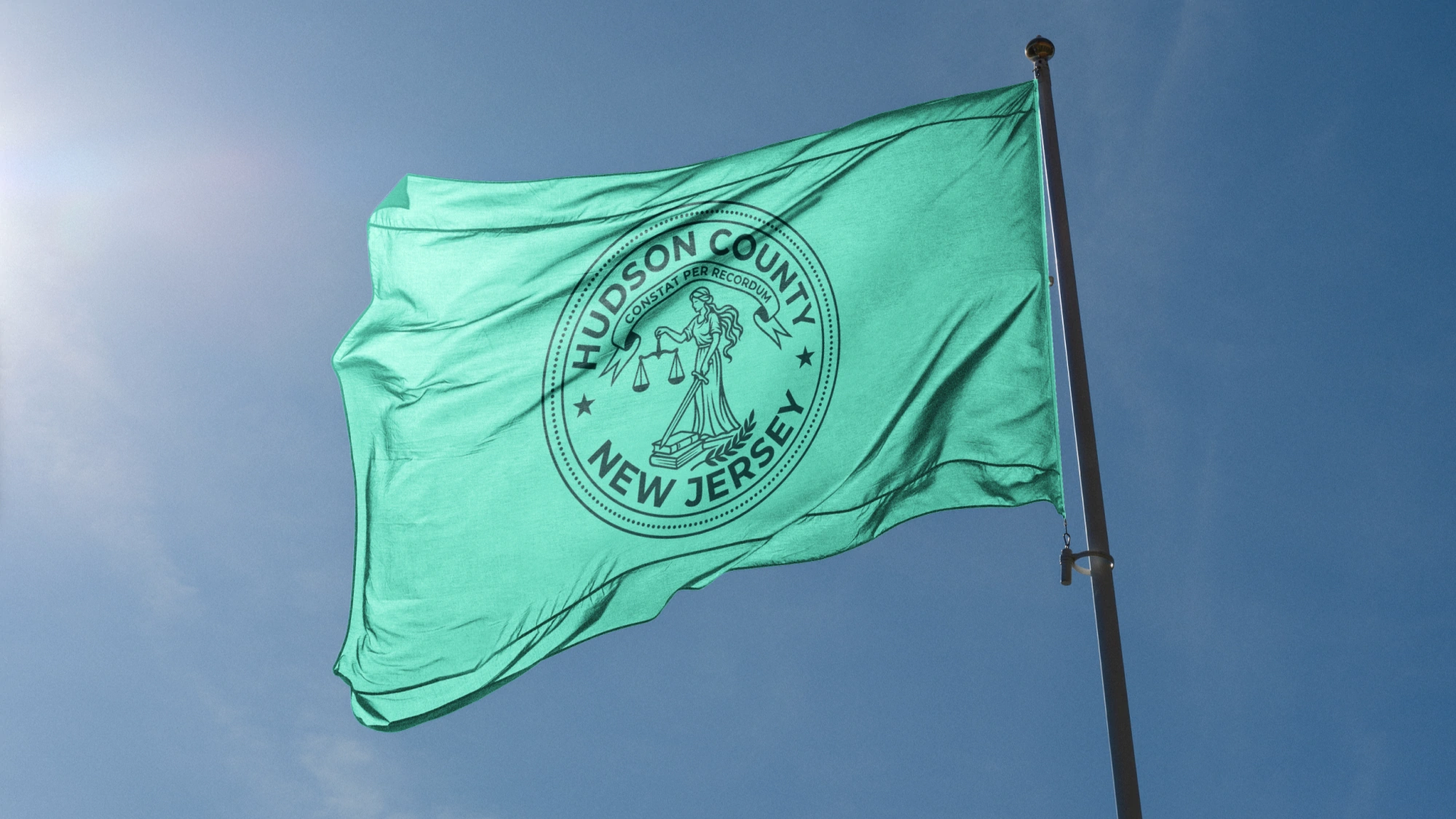
When we launched the Hudson County rebrand, a man in Moscow complained about how the tax money was spent. He doesn't live in Hudson County. He doesn't live in the United States. He was upset anyway.
The people it was made for live in Hudson County, and most of them never asked for a rebrand either. They'd never thought about the county's brand at all. The old identity was plain and easy to miss. That's who public work is for, and it's the best part of the job: you get to hand people something that's theirs, that represents who they are, and that's worth being proud of.
Who is a public rebrand for?
Residents. A company's customers chose the company. A county's residents just live there, and the county shows up in their day whether they think about it or not. On a sign, a form, the side of a truck.
I believe design matters in every part of our lives, not just websites and logos. We're surrounded by visual pollution. We started this business to bring a little order to that and make something beautiful. Public work is where that idea gets tested, because the audience is everyone.
What was wrong with the old identity?
It never drew attention. It had scattered across departments, with primary colors applied at random and a seal that struggled at the sizes it was used most. The county does critical work, and it was close to invisible in the places that work happens.
.webp)
Ask someone from Hudson County where they're from and they'll say Jersey City. Or Hoboken, or Bayonne, or Union City. Nobody says the county.
That's a shame, because Hudson County is one of the densest, most diverse places in the country. The food, the language, and the music change block by block. County Executive Craig Guy wanted the branding to finally match that culture. The old identity said almost none of it.
How do you design something a whole county can call theirs?
You start with who lives there. Moxie Strategies led the research, strategy, and messaging, and we handled the visual identity. The brief gave us the real test: does this feel understandable and respectful to someone who doesn't already trust the government?
Every decision answered to a resident.
- A wide, loud color palette, for a county whose character changes block by block. Departments and towns can sound like themselves and still read as one government.
- Every color pairing checked against ADA contrast standards, including type on top of brand colors, for residents who'd otherwise be left out.
- A redrawn seal with the county's name set plainly beside it, for anyone reading it from a lapel pin to a highway sign.
- A system built to be multilingual-ready, for the county's immigrant and multilingual communities.
- A guidelines site in place of a PDF, for the department staff who apply the brand and weren't in the presentation.
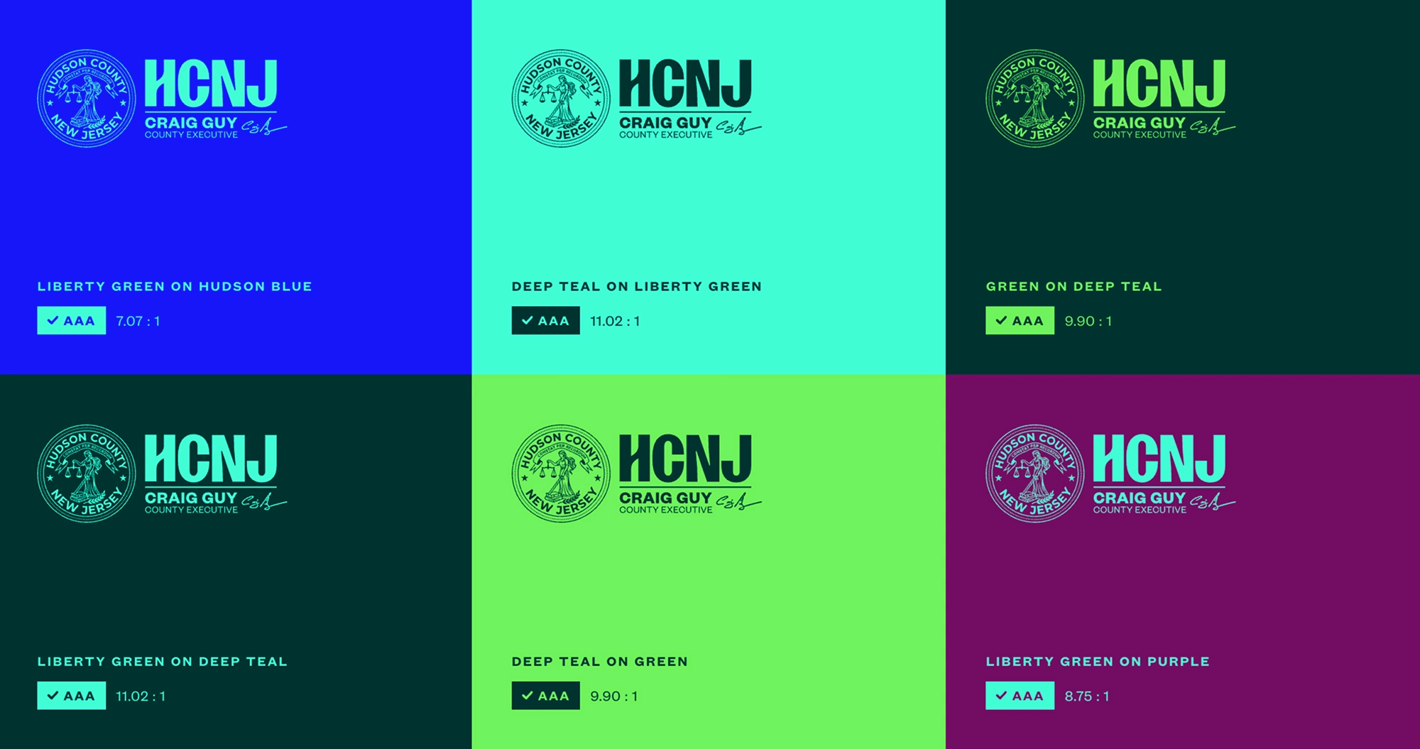
The logo is plain on purpose. No skyline. No Statue of Liberty. Designing for everyone sometimes makes things look simple, and that's okay. The system around it is where Hudson County comes to life. You can see all of it in the Hudson County case study.
What do residents get out of it?
Something that belongs to them. A county that's visible in the places it does its work. Colors loud enough to match the place. A seal they can read, and a system that was checked, pairing by pairing, so nobody gets left out.
Real people spent a long time on this, with care, thinking about neighbors from all walks of life. We love what we do, and we got to spend that on twelve towns that had never been shown as one county.
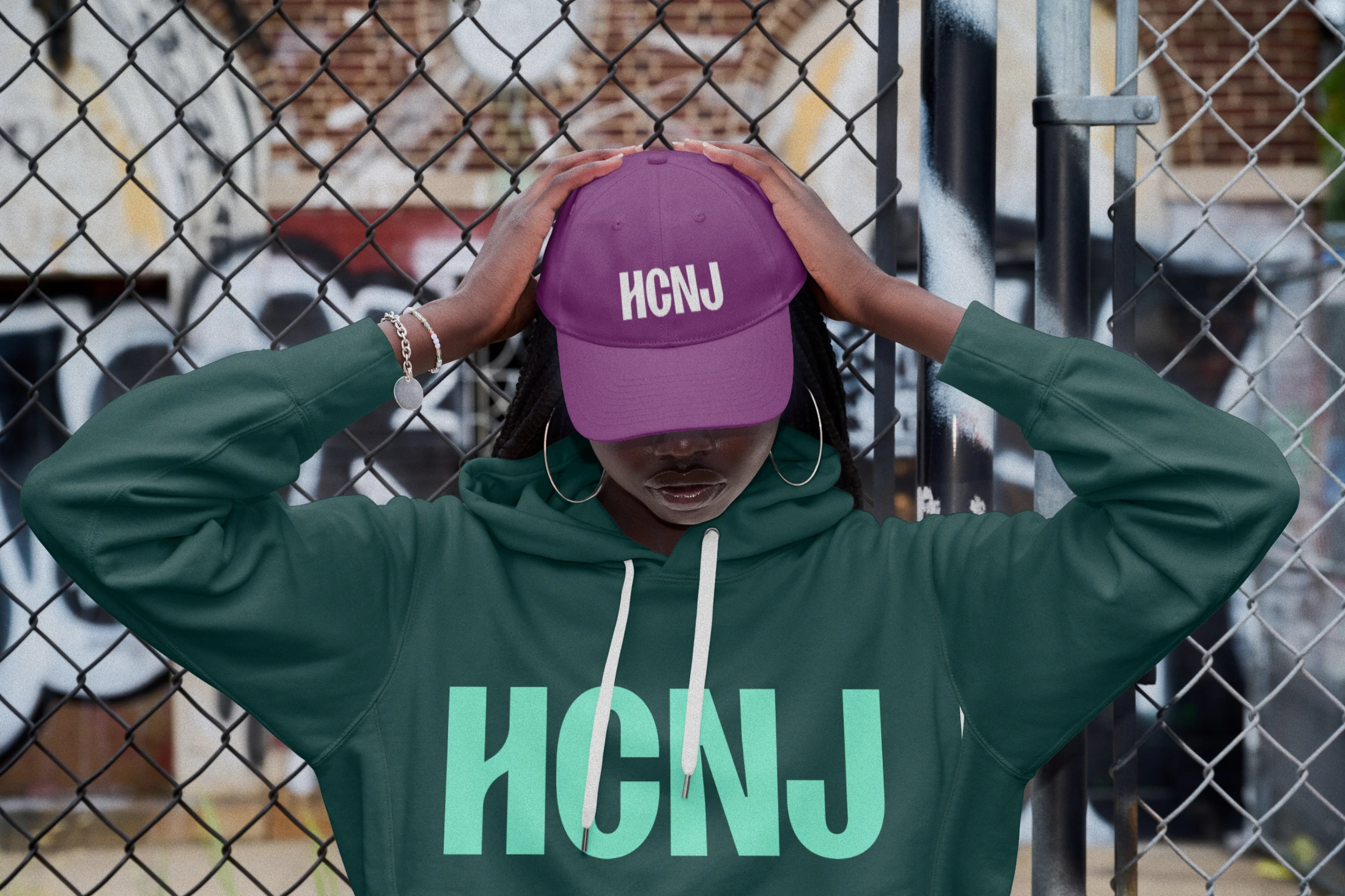
The work was featured on Brand New, which was an honor for our team. The better result is quieter. Pride in a place takes longer than a launch, and it shows up in small ways. Someone finds what they need a little faster. Someone sees the seal on a sign and knows it's theirs.
That's what I know from doing this. Someone else may have seen public work go another way.
Related Posts

.avif)

it starts with a conversation
Don’t hesitate to contact us. We aim to provide value to everyone who does.