Work

Building on masterclass branding expertly crafted by one of our favorite branding agencies BBMG (shameless plug), the Paper Tiger team got to bring the bold, unabashed, and beyond-entertaining vibe of Just Salad to the digital realm. Snappy animations that accent the crisp feel of their messaging (and triple-washed lettuce), and a smooth transition to online ordering delivers a website as fresh, clean, and appetizing as their made-to-order meals. Enjoy the magic. Try to romaine calm.


Hi-Rez Studios has been a trailblazer in the gaming world since 2005, known for hits like Tribes: Ascend and Paladins. As they geared up to launch SMITE 2, a groundbreaking MOBA designed for all platforms, they tapped us to create an online hub that not only matched the game's dynamic interface but also resonated with its dark, futuristic feel. This wasn't just about building a website; it was about crafting an experience that mirrored the excitement of the game itself.


A fully-loaded hub of custom graphics, animations, seamless navigation, and smart content for a fast-growing company changing the world one wireless charge at a time. With intricate, detailed graphic to tell the succinct story of their proprietary technology, the result is an oh-so-smooth user experience that makes getting where you need to go faster and easier (kind of like their charging capabilities).


A full e-commerce overhaul for a trailblazing CPG brand revolutionizing flour-based foods. Equipped with a stunning, easy-to-search recipe hub for 150+ recipes, dual shopping experience for direct buy and retail, and a blend of unbelievable imagery, live animation, and custom interactive elements, the result is so egg-ceptionally good you could eat it.

.webp)


Meet Bonusly: A powerhouse transforming workplaces into spaces where recognition and feedback flourish. They had a big idea: to make their online space as vibrant and effective as their solutions. Imagine trying to invite more color and energy into your home but finding the walls too rigid to change. That was Bonusly, stuck with a digital presence that felt a tad too yesteryear for their forward-thinking brand.


Cinch has been the mastermind helming some of the food, beverage, and hospitality industry’s biggest campaigns, so it was imperative we put that track record of success front and center on their new website. With custom imagery, graphics, and animated graphics in an oh-so-clean interactive design, the result is a web presence as powerful as the content they produce.


A rebrand and website redesign for one of the most recognized financial software solutions in the game, Quicken. With a bolder, fresher, sharper brand identity in tow, we did a ground-up reimagining of Quicken’s look and feel, while still paying homage to their 50+ year legacy as a trusted financial partner for their customers.


We recently unveiled the k-ID website, a beacon of creativity and child safety online. With Webflow's dynamic platform, we crafted a site that embodies k-ID's mission: making digital spaces safer for kids. This collaboration epitomizes our dedication to impactful design, merging aesthetic finesse with functional excellence for a safer internet.


A sleek new website build for the VIP of in-play betting, SimpleBet. Building on their existing branding, we used authentic imagery, UI mockups, and custom infographics to showcase the newest expansion in their industry-leading product suite. Put simply — the result is a, *ahem*, home run.


For AssemblyAI, a leader in Speech AI technology, our agency embarked on a transformative journey to refine their logo and revitalize their brand. We developed comprehensive brand guidelines that not only honor their AI expertise but also introduce a new visual identity with rich colors and gradients, establishing a distinctive look and feel that stands out in the tech industry.


Using our in-house CSS and JS expertise, we conducted an advanced redesign of the PBS North Carolina website using a 2-layer reskin solution (Code Name: Celsius) to meet — and then exceed — the project’s tricky technical requirements while remaining compatible with their proprietary CMS. That’s just how our devs do it.


Furey Financial, a purveyor of bespoke financial services such as Accounting, Payroll, and Finance for startups and burgeoning enterprises, found a digital embodiment of their ethos through our craftsmanship. Leveraging the robust capabilities of Webflow, we sculpted a website that radiates both simplicity and vitality. This endeavor not only elevated their brand's digital footprint but also meticulously mapped their array of services onto a canvas of engaging abstract visuals, all underpinned by a user experience strategy meticulously engineered to foster conversion.
.webp)


A captivating experience designed and built for Insider, Inc. using refreshing colors, textures, and a newfound boldness. Immersive media elements and interactive moments deliver a fresh new hub that’s fun and irresistible—just like the content you’ll find on the master publisher’s pages.


Elementus, at the helm of democratizing quality blockchain data, recently debuted a redesigned website, merging visual elegance with their core mission of revolutionizing industries at web3 scale. The result is a digital space that not only captivates users but also encapsulates Elementus's commitment to driving transformative change through accessible and high-quality blockchain insights.

.webp)

.webp)
A new visual brand identity, brand strategy, and polished new website for the leading network & fellowship program in the Venture Capital industry. By integrating a searchable directory of over 800 Fellows and building a custom all-one-resource hub to showcase the work of their Fellows, Kauffman’s new site delivers a seamless (and stunning) user experience for each of their audiences—fellows, entrepreneurs, investors, and LPs alike.


A digital meeting place for the most innovative financial minds in the market was on the docket for F Suite, so we doubled down on clean infrastructure, simple animation, and financial-focused illustrations designed to speak directly to F Suite’s target audience: the CFOs helming the fast-growing tech companies in the world.


A powerhouse pairing of storytelling and custom visuals tells the impactful story of Prestige Scientific, a renowned executive search company helping global innovators secure critical funding and build successful commercial teams. Starting with a new visual identity and ending with a website reveal, the result is a masterclass in… well, prestige.


A new online experience was crucial for one of the biggest names in the parent community (the industry standard for car seats and strollers) as they entered a company-wide transition from brick-and-mortar to e-commerce-centered. We did it with high-converting PDPs, an easy-to-manage backend, accelerated load times, and a simplified checkout flow.

.webp)
.webp)
.webp)

When your business is music, your website’s gotta sing. So we popped in our AirPods, threw on the best in punk rock, and got to work building a beaut of a site for Sizzr stacked with a rhythmic infrastructure, bold style, and 100% unique animations that—quite frankly—deserve a nod for Album of the Year (call from the Grammys still pending.)


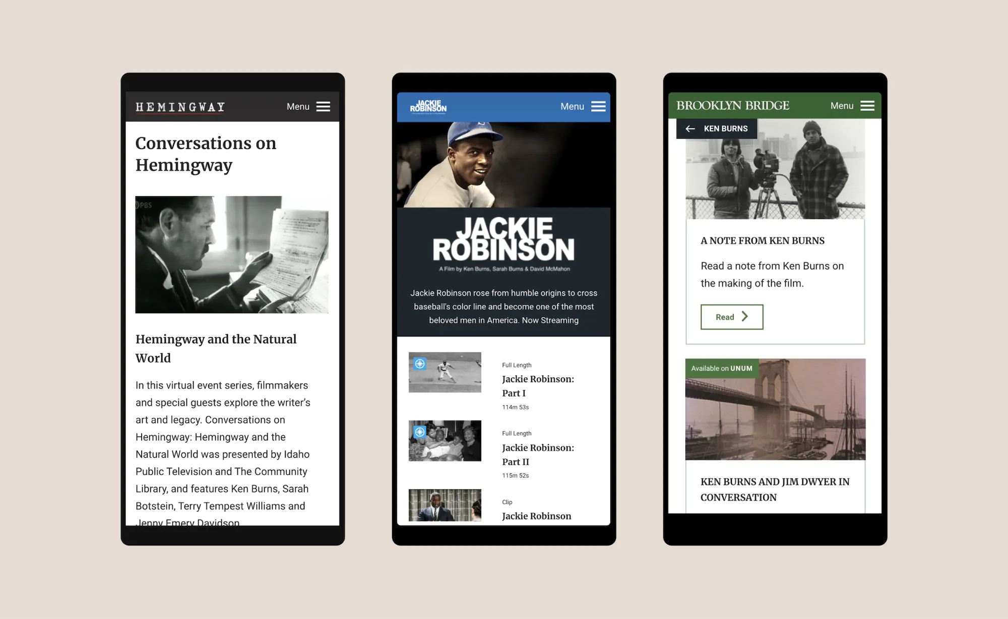
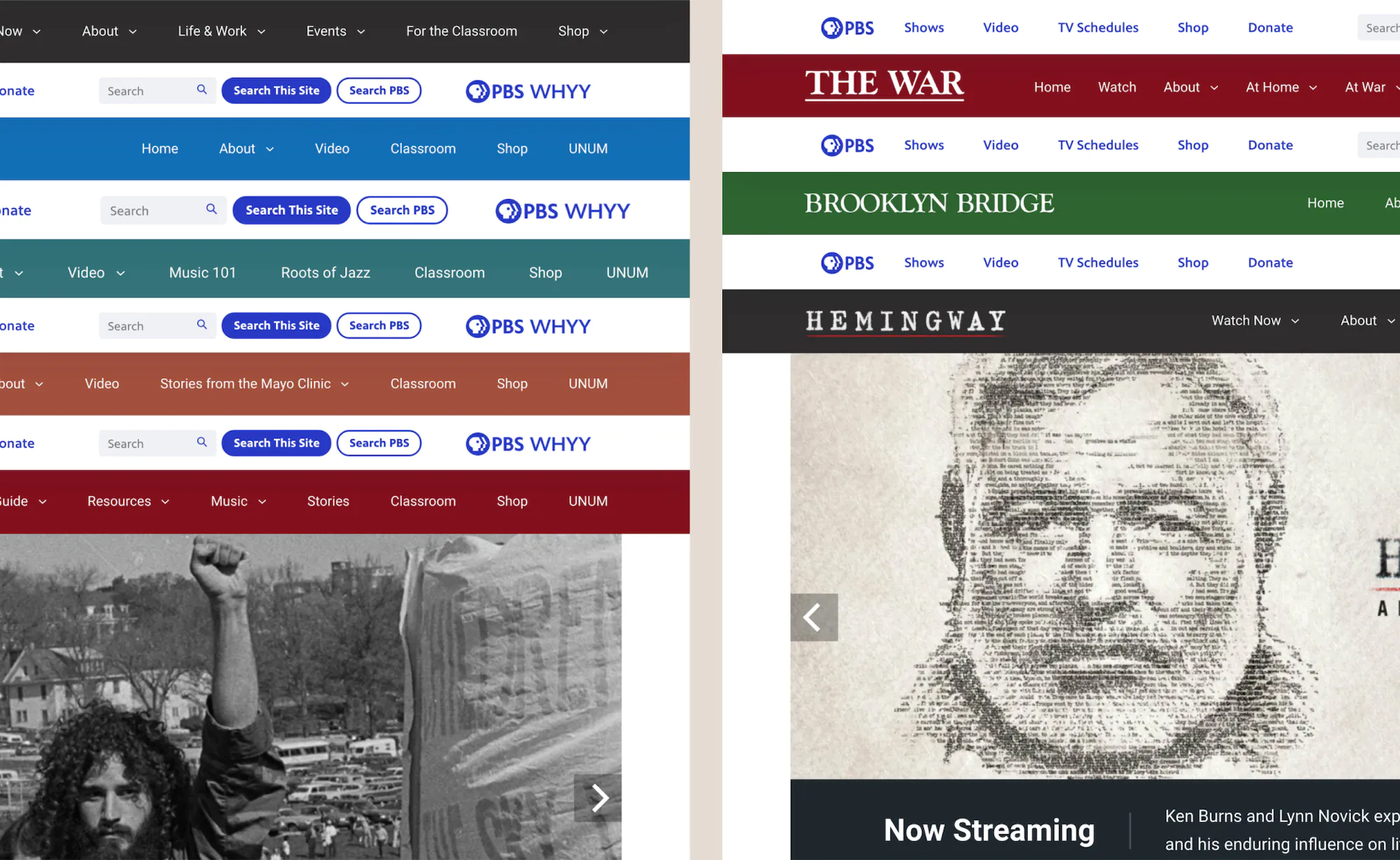
A powerful, intuitive experience for our long-time client PBS, showcasing the brilliant production work of documentarian and filmmaker Ken Burns. Combining dynamic content and interactive grids, the microsite provides easy navigation through featured shows, films, and interesting insights tailored to Burns’ avid following.


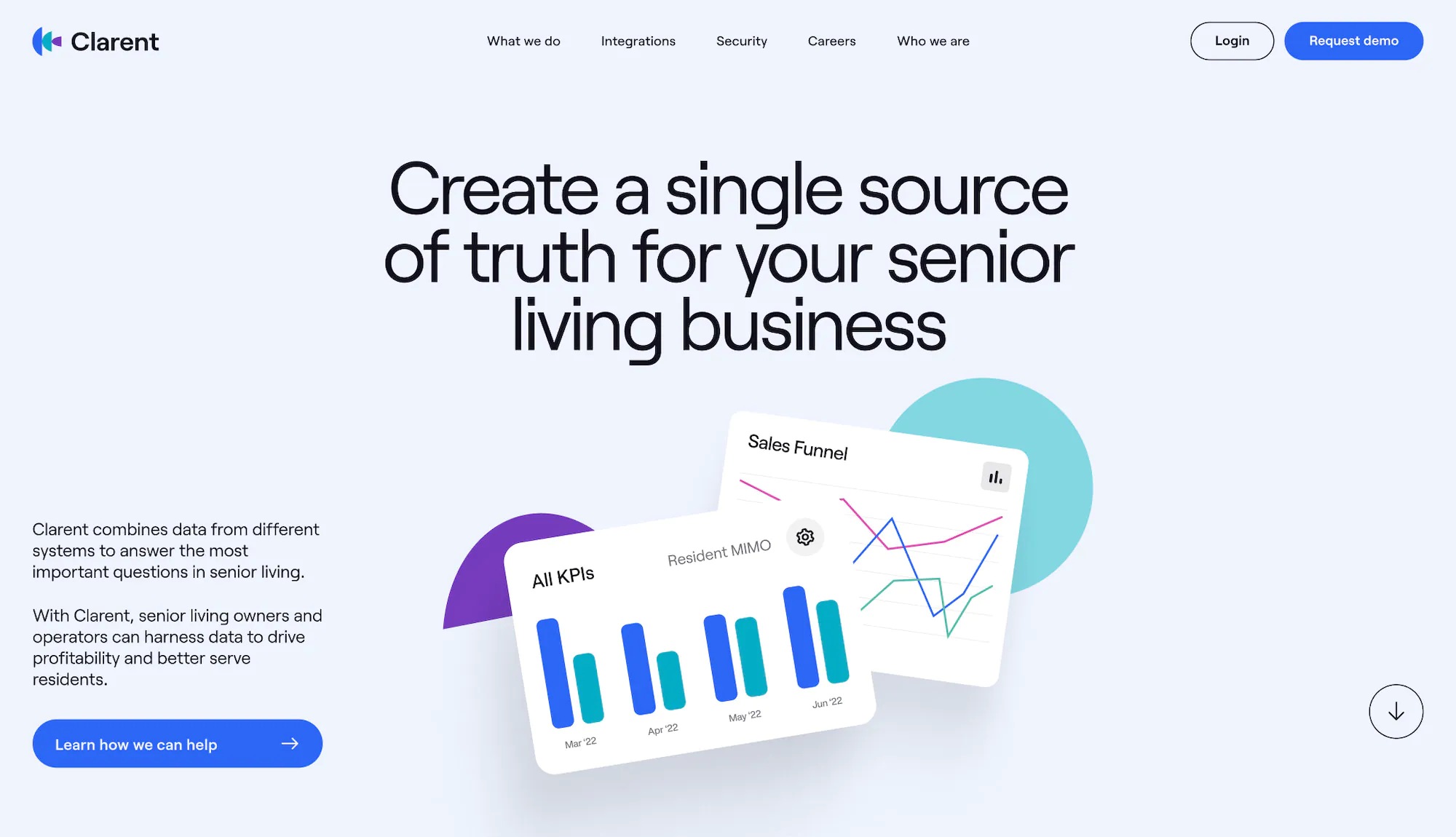
Clarent, the self-proclaimed data maestro for senior living, underwent a branding facelift, transforming its web design from “spreadsheet chic” to user-friendly elegance. With content that reads less like a software manual and more like a riveting novel, Clarent now helps senior living bigwigs make decisions without the headache-inducing side effects of traditional data overload.
.webp)


Not all hotels—or online booking experiences—are created equal. Sit back, sip cucumber water, and scroll through the hyper-modern site we designed for Salt Hotels to mimic their in-person high-end spa vibes and superior guest services. High-def images of their multiple locations and enticing deets about their offerings, packaged in a clean-and-compelling aesthetic. Destination: Right where you wanna be.


A luxurious, scalable experience for smart home technology giant Crestron Home that drives downloads, directs users to product pages, and showcase their award-winning services, 24/7 customer support, and evolving platform that redefines cutting-edge. Operation: make visitors feel right at home.


An event hub/music library/online shop hybrid that hits all the right notes for award-winning musician and recording-artist Mitski. Equipped with dynamic pages to advertise upcoming tour dates, links to music, and a comprehensive music video library, the final product is a true Pearl (Be the Cowboy Album, Track 4.. you won’t be disappointed.)


A fresh brand look and feel translated into a new intuitive website experience for Alt Source, the leader in white-glove software development. With a virtual gateway that opens with a deep dive into both their services and the powerhouse clients they’ve already served, Alt Source’s new digital home leaves zero doubt in its ability to deliver on its (myriad of) customers’ needs.


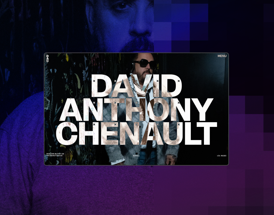
David Anthony Chenault is an interior designer based in Washington D.C. who’s built a brand declaring mutiny on the monotonous. The website we built reflects that mission, with off-the-wall animations to grab attention, oversized imagery to emphasize the details, and poetic copy that teleports you right into the spaces it describes.


.webp)


A three-in-one brand overhaul and website design for the architectural design firm we have to thank for experience that the likes of Margaritaville brings to the world. With an emphasis on story-telling via compelling messaging and custom imagery, the end result hits all the right notes.


A microsite that sits at the intersection of intuitive and innovative, for the digital publication that sits on the intersection of science and society, Undark. Working within their brand guidelines, we were tasked with the design and build of a new immersive experience to tell the succinct story of one of Undark’s deepest research libraries - race science.


A best-in-class site for Business Intelligence Group - a business awards org recognizing best-in-class companies (sans the corporate stodge). In an industry typically stuffed with dry, droning language and barely-basic visuals, we made this brand’s differentiators clear with quippy, approachable messaging and bold, vibrant imagery and animations that make business award nominations an experience execs can start to look forward to.


